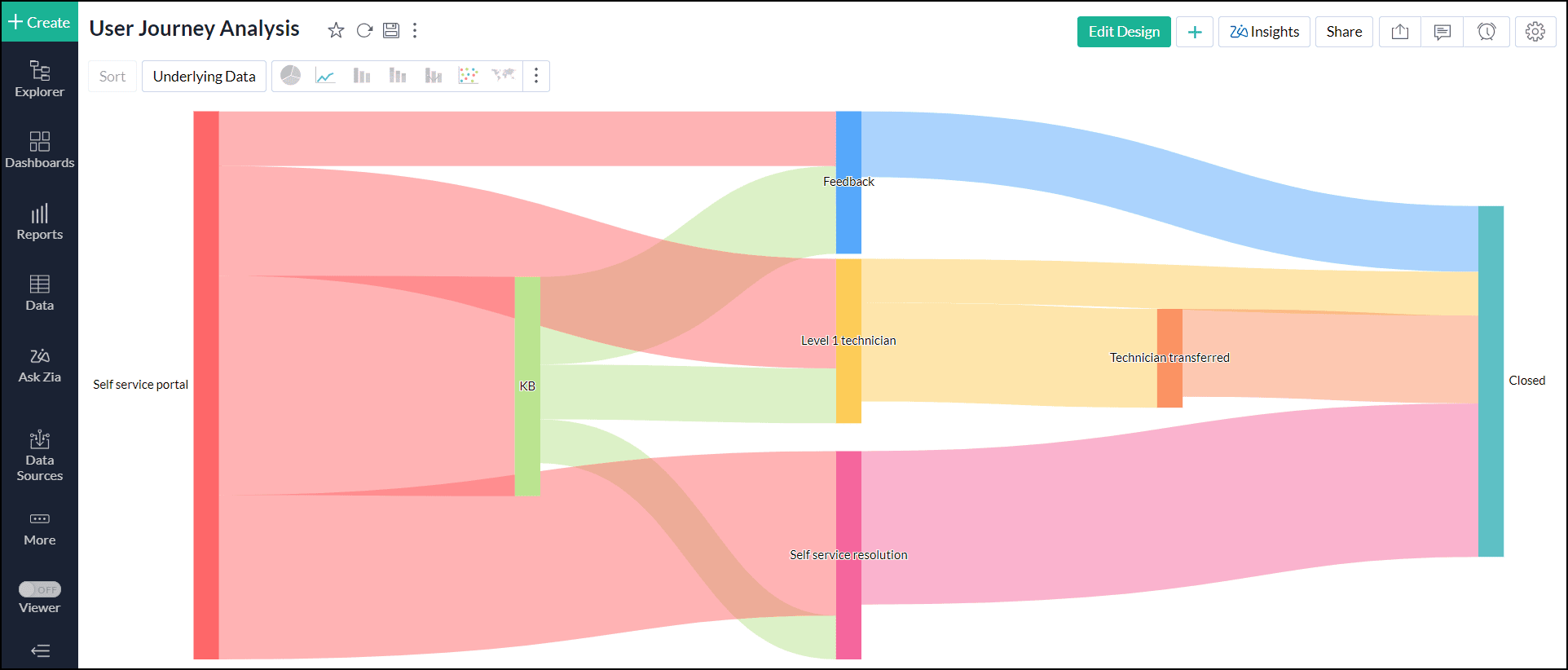
Sankey chart
A Sankey chart is a visualization that shows the directional flow of processes and activities from an initial node to a terminal point through interconnected lines. The width or thickness of the interconnecting lines is proportional to the flow rate. The width of each connecting line is determined by the value of the corresponding pairing, relative to other values present in the data.
When to use
- To visualize the customer's journey from initiation to purchase.
- To understand the movement of stock in a supply chain.
- To map out website traffic flow and the user journey.
Data requirement
A minimum of two dimension columns and one measure column is required to create a Sankey chart.
Creating sankey charts
- Access the table for which you want to visualize the flow.
- Click the Create icon on the side navigation panel and choose New Chart View from the drop-down menu.
- In the chart editor, add the columns as given below:
- X-axis: Add a dimension column that denotes the initial node of a process or activity.
- Y-axis: Add a dimension column that denotes the terminal node in a process.
- Click Generate Graph. A scatter chart type will be created.
- Change the chart type to Sankey.
Possible combinations for creating sankey charts
| X-axis | Y-axis | Color | Text | Size | Tooltip | |
| Case 1 | Dimension | Dimension | - | Aggregate/ Measure | Aggregate/ Optional | Aggregate/ Measure/ Optional |
| Case 2 | Dimension | Dimension | - | Aggregate/ Measure/ Optional | Aggregate | Aggregate/ Measure/ Optional |
| Case 3 | Dimension | Dimension | - | Aggregate/ Measure/ Optional | Aggregate/ Optional | Aggregate/ Measure |