Sparkline
Sparklines are compact charts that show the trends and variations in the data, without taking up much space. They are widely used alongside pivot tables and help grasp trends and insights quickly. For instance, sparklines can be used to visualize the trend of sales figures, expenses, or other metrics across different categories or time periods.
Types of Sparkline
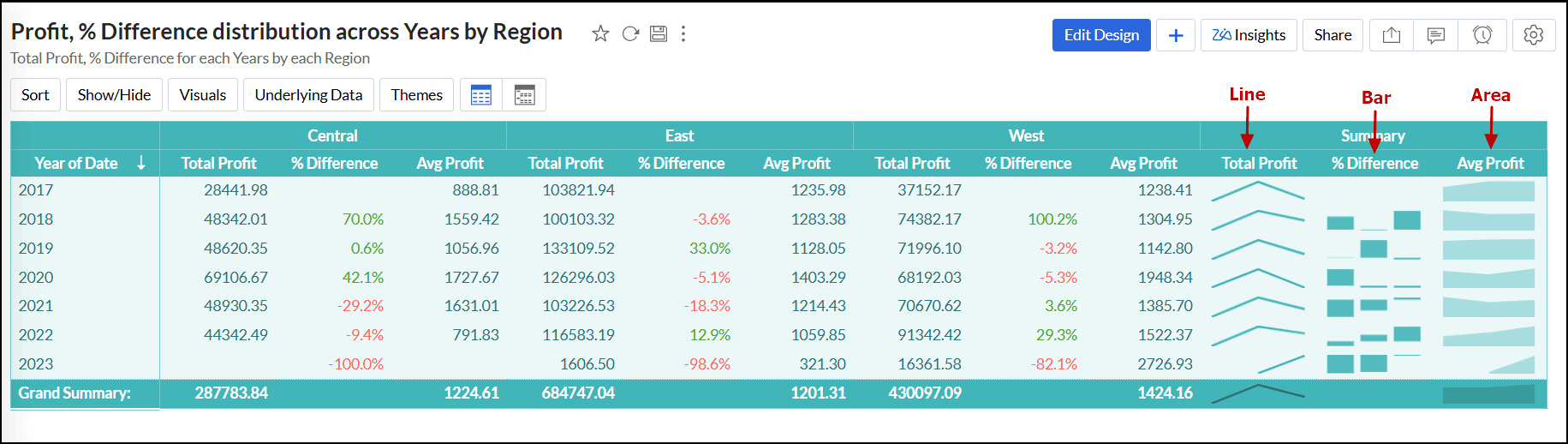
- Line: Uses a line chart to represent data trends over time, making it easy to spot fluctuations or patterns in a compact form.
- Bar: Uses horizontal bars to show data values, allowing for a quick comparison of the magnitude of different data points.
- Area: This chart fills the area beneath the line with color, emphasizing the volume or magnitude of the data changes over time.
Adding Sparkline to the pivot table
Follow the steps below to add Sparkline to the pivot table:
- Open the desired pivot view in View mode or Edit Design mode.
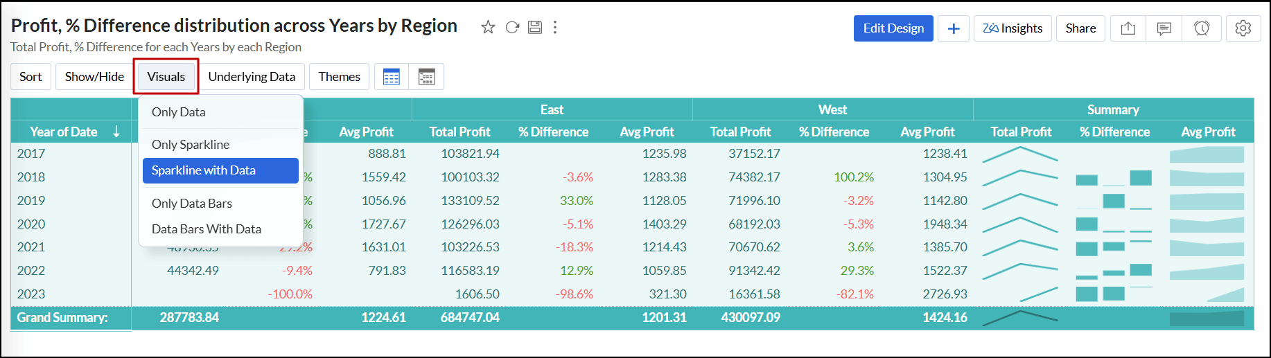
- Click the Visuals button on the toolbar and choose one of the following options:
- Only Data: This is the default option, where the report displays only the data based on the columns placed on the designer shelf.
- Only Sparkline: This option shows only the data trends for the selected columns without displaying the raw data values.
- Sparkline with Data: This option displays the data trends and the corresponding data values.
Customizing Sparkline
To customize the Sparkline added in the pivot table, follow the steps below:
- Open the desired pivot table with Sparkline in View or Edit Design mode.
- Click the Settings icon at the top right corner.
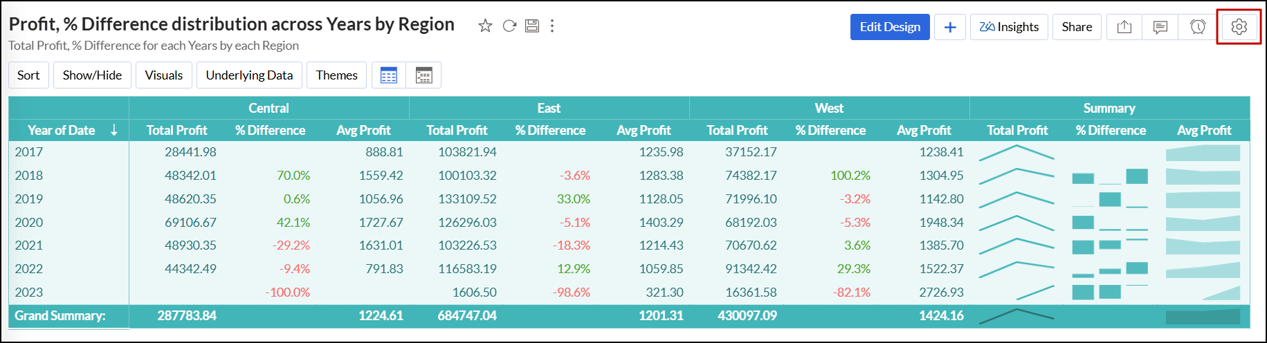
- In the window that appears, navigate to the Sparkline tab.
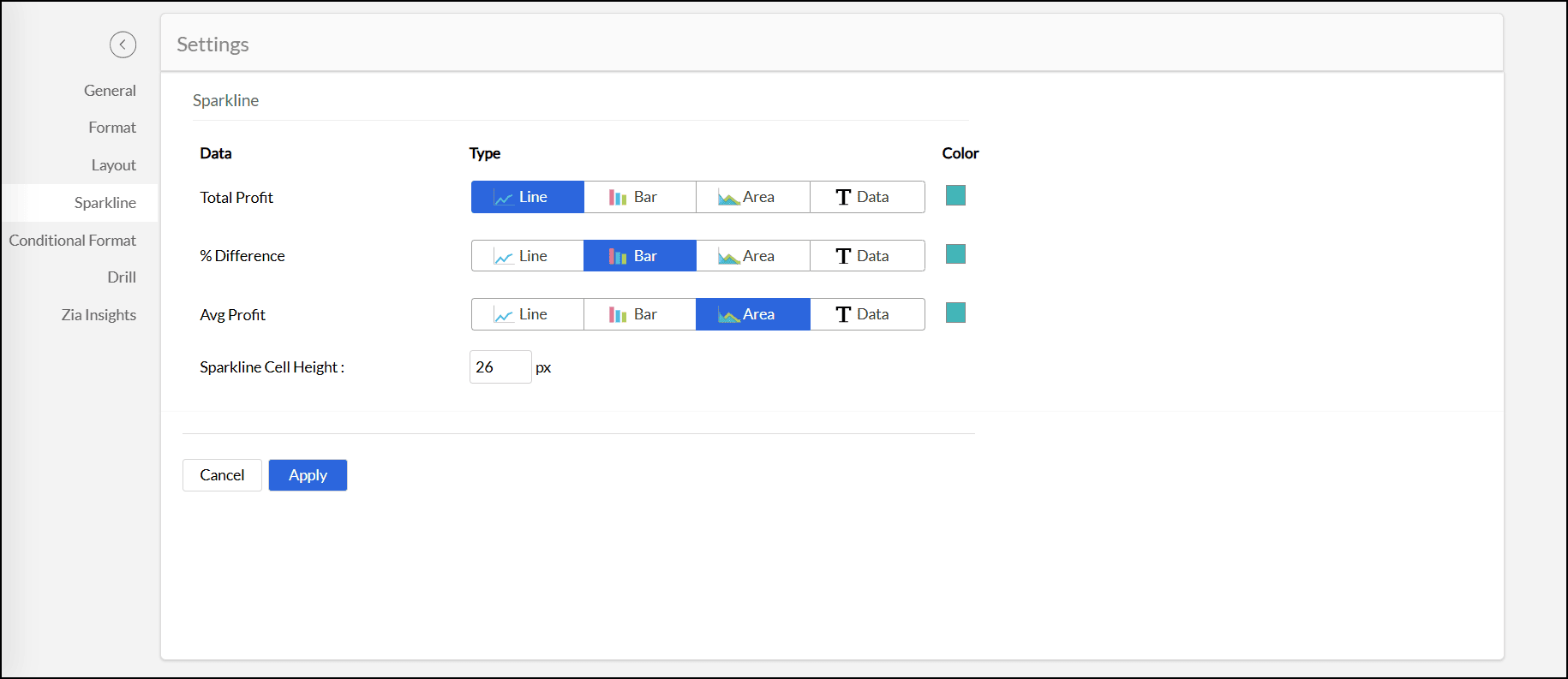
- Modify the settings detailed below as needed to adjust the appearance of the Sparkline:
- Type: Choose the desired type of Sparkline. Click here to learn about the types.
- Color: Select a color for the Sparkline.
- Data Bars Cell Height: Enter your preferred height value in pixels for the Sparkline.
- Click Apply to save the changes.
Note:
- The data values are grouped based on the dimensions placed on the column shelf. When multiple dimensions are added, the Sparkline will be generated based on the last dimension in the column shelf. For example, if both Date (Year) and Date (Month) are placed on the column shelf, the Sparkline will be displayed for each month within each year.
- Sparklines can only be exported in the HTML format.