Overview and Scroll Bar effect in charts
The Overview and Scroll Bar effect in charts allows you to visualize reports with large data sets. With this, you can select the subset of data in the chart to focus on a particular region in reports, which visualizes the leaps and bounds clearly.
Dynamic and more interactive scroll charts can be used to replace filters which are traditionally used in reports with large data sets. Adding filters to the reports makes them less interactive and you must manually change them to compare the data.
The main advantages of using scroll charts are:
- Get an in-depth analysis by focusing on a specific region.
- Visually compare data by moving the slider or scroll bar.
- It makes interactive reports and can be used as a filter.
Analytics Plus allows you to add an overview slider or scroll bar to the charts in the following two ways, are
Note: To apply scroll effect, your data must be plotted across the axes (X and Y-axis). You cannot apply it across charts like Map chart, Pie Chart, etc., which has no axis.
Overview Effect
The Overview Effect adds an overall preview chart (also known as an overview chart) to the bottom of the regular chart. You can adjust the slider in the overview chart to get more focused on a particular region of the chart for in-depth analysis.
You can also use the Brush effect in the Chart to select and focus on a particular area, which adjusts the slider bounds in the overview chart.
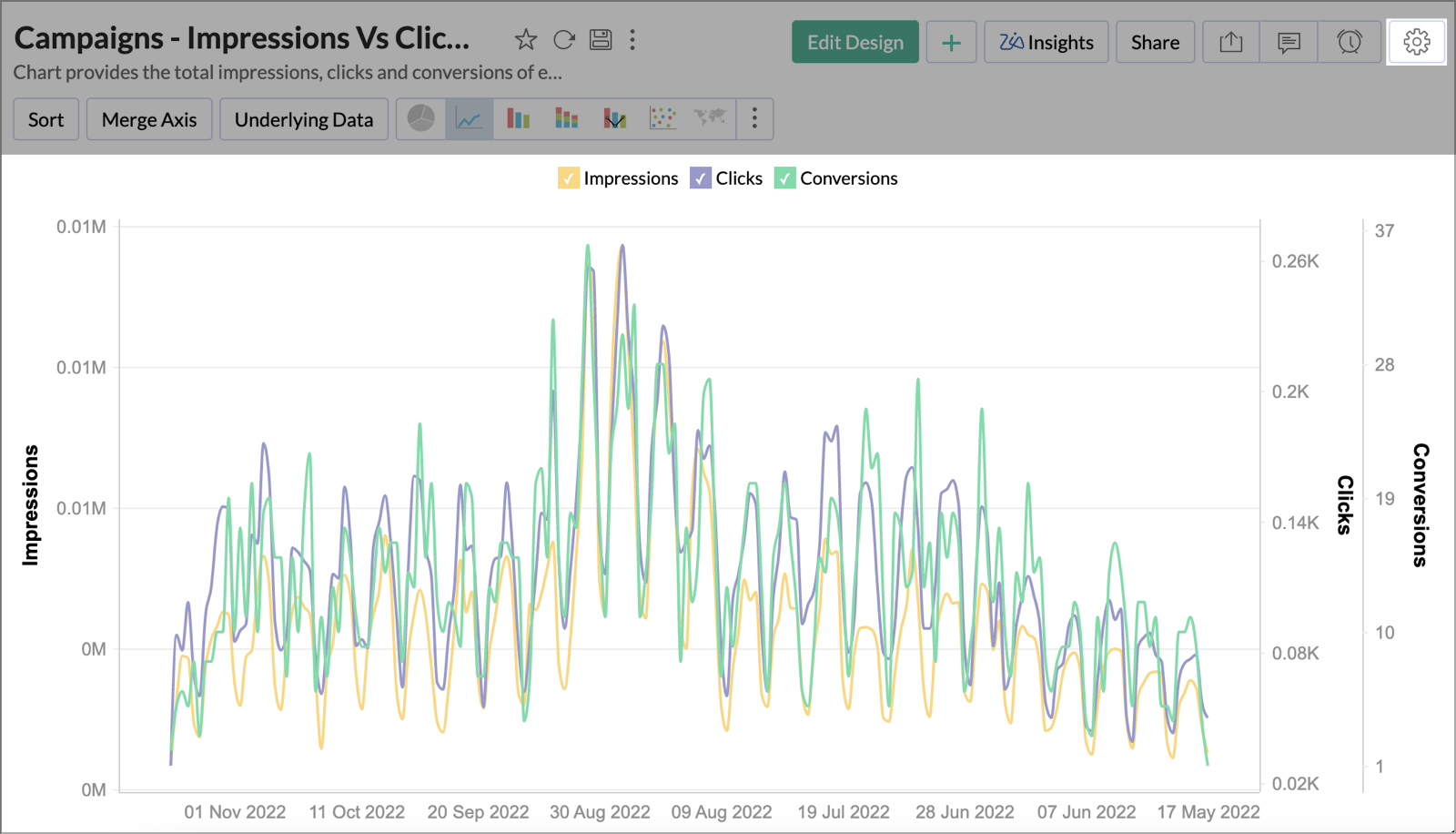
For example, take a report analyzing the Campaigns data - Impressions vs Clicks vs Conversion. To enable the overview effect in the above report,
- Create a new report or open an existing report, to which you want to add the Overview Effect.
- Select the Settings icon on the top right corner of the report.
- Under the General Settings, select the Overview Effect from the Overview or Scroll Effect section.
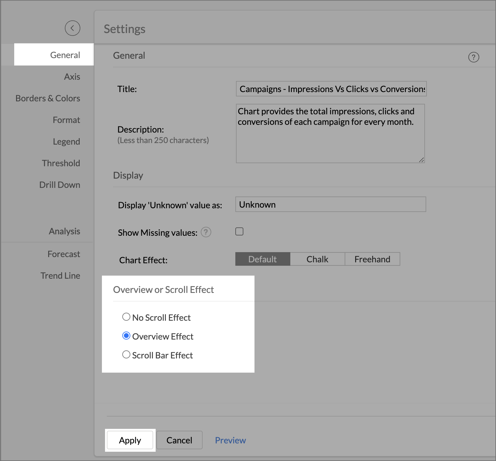
- Click Apply to continue.
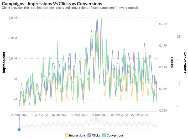
In the above chart, you have added the Overview Effect.
- The overview chart is added at the bottom of the regular chart along with the slider.
- Select an area on the chart to focus on that particular region.
- The slider highlights the selected area on the overview chart. You can also adjust its bound to focus on a region.
- You can move the slider on the overview chart to compare different regions of the chart visually.
Scroll Bar Effect
Analytics Plus allows you to scroll across the reports using the scroll bar. You can also modify the thickness of the scroll bar based on the volume of your data. The Scroll Bar effect is more suitable for vast data sets comparatively.
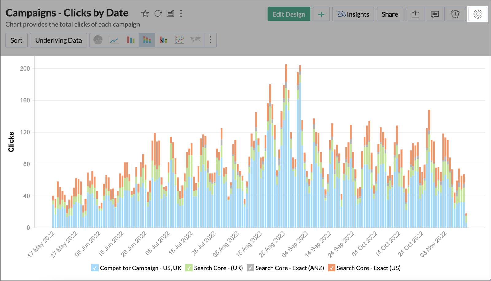
For example, take a report analyzing the Campaigns - Clicks by Date. To enable the Scroll Bar effect in the above report,
- Create a new report or open an existing report, to which you want to add the Scroll Bar Effect.
- Select the Settings icon on the top right corner of the report.
- Under the General Settings, select the Scroll Bar Effect from the Overview or Scroll Effect section.
- You can modify the thickness of the scroll bar, by adjusting the Category Thickness bar based on your data volume.
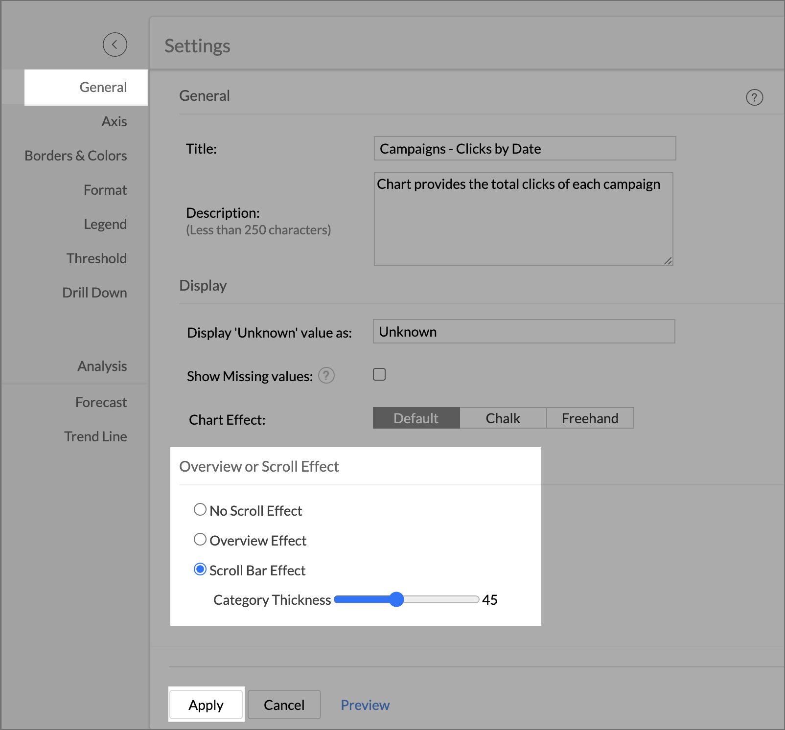
- Click Apply to continue.
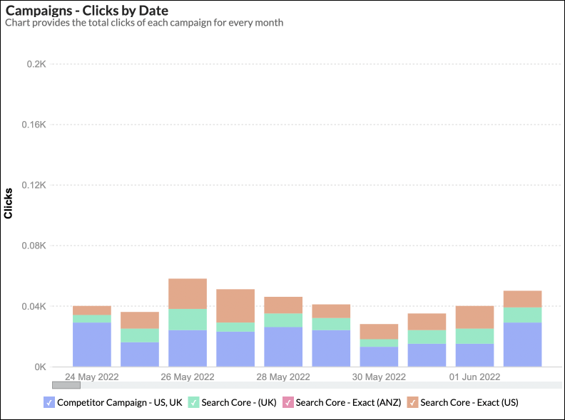
In the above chart, you have added Scroll Bar Effect.
You can scroll across the report, using the Scroll Bar at the bottom. You can visually compare data across different regions, by sliding the scroll bar and also get in-depth analysis by adjusting its thickness in Settings.