Understand Gauge element in a page
A gauge is used to visualize single-valued metrics, such as revenue performance for the year-to-date or other marketing and sales goals. In other words, a gauge visually represents a goal/target and how your business metric is progressing towards that goal/target. This element is great for displaying KPIs, such as average duration of support executive’s calls, number of bugs raised, number of solved risks, etc.
For example, a gauge can be used to show the current sales progress of a team and how far the team is from the monthly target.
A gauge is also used to display your business status in a predefined range/state.
For example, a sales metric can be represented as bad, average or good sales; where bad, average and good are the ranges or states.
Below is an image that shows two gauge elements — Sales last month and Sales this month, on a page in AppCreator. The left side i.e the portion before target (dotted line) is the minimum range and the right side i.e the portion after the target is the maximum range.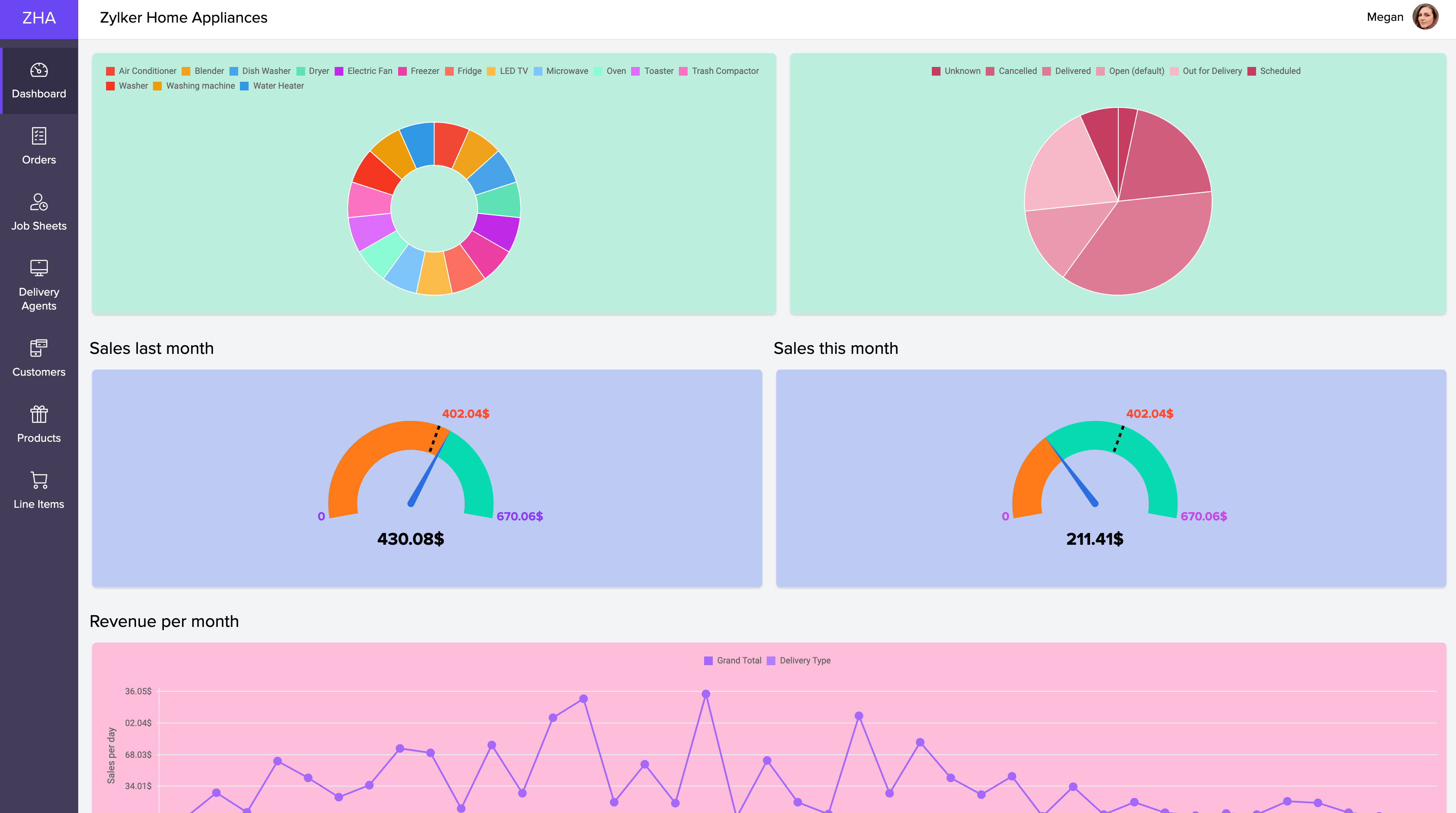
The major elements of a gauge include:
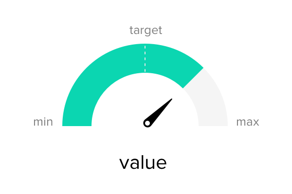
| Element | Description |
| Minimum | Specifies the lowest point on the gauge value axis. By default, the minimum value is set to 0. |
| Maximum | Specifies the highest point on the gauge value axis. |
| Target | Specifies a goal value or an objective towards which the data is approaching. |
| Pointer/Needle | Indicated the current value plotted on the gauge. |
| Range | Specifies categories/ groups of scale values at intervals. |
| Value | Displays the actual value of a gauge fetched from the app. (App Metric) |
Different types of gauges available in ManageEngine AppCreator are:
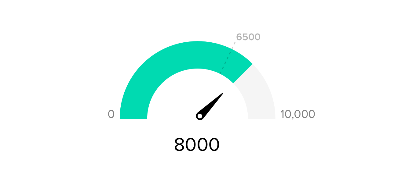
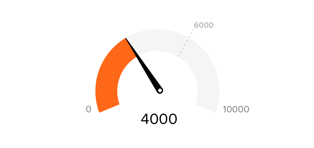
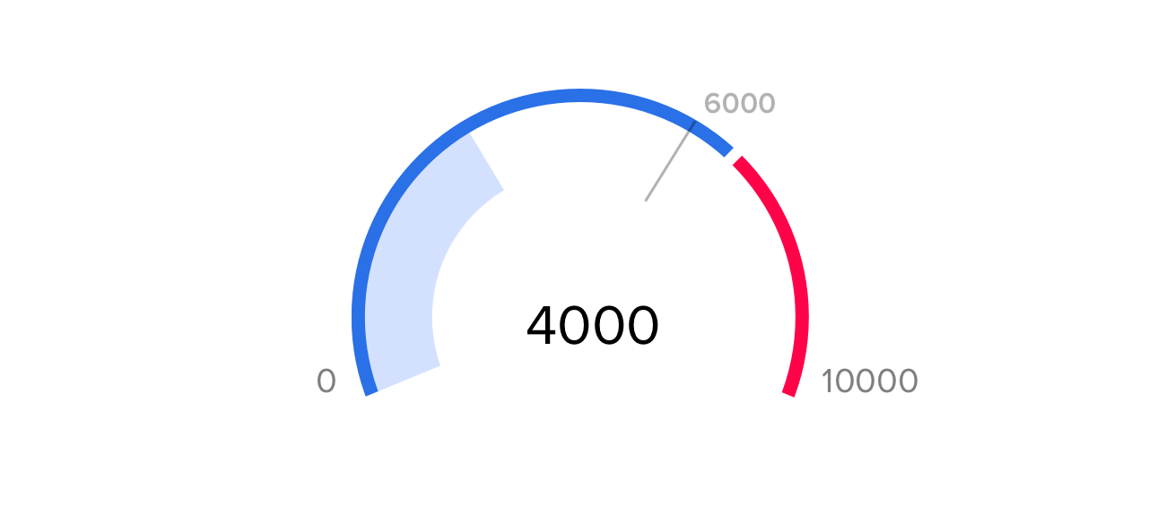
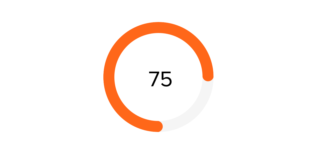
| Radial Gauge | Pie Gauge | Linear Gauge |
| Displays an arc around the pointer with a start (minimum) and end (maximum) value | A variation of radial gauge, where the scale forms a complete 360° circle. | A horizontal representation of scale. |
   |  |  |
App Metrics that can be displayed in a gauge using the data in ManageEngine AppCreator are: