Tips and Tricks
We've compiled a set of tips and tricks to help you get the best out of the features Analytics Plus has to offer. These are organized under different headings depending on the stage of your analysis, ranging from data import to report generation.
Data import from spreadsheets and local databases
1. Data categorization
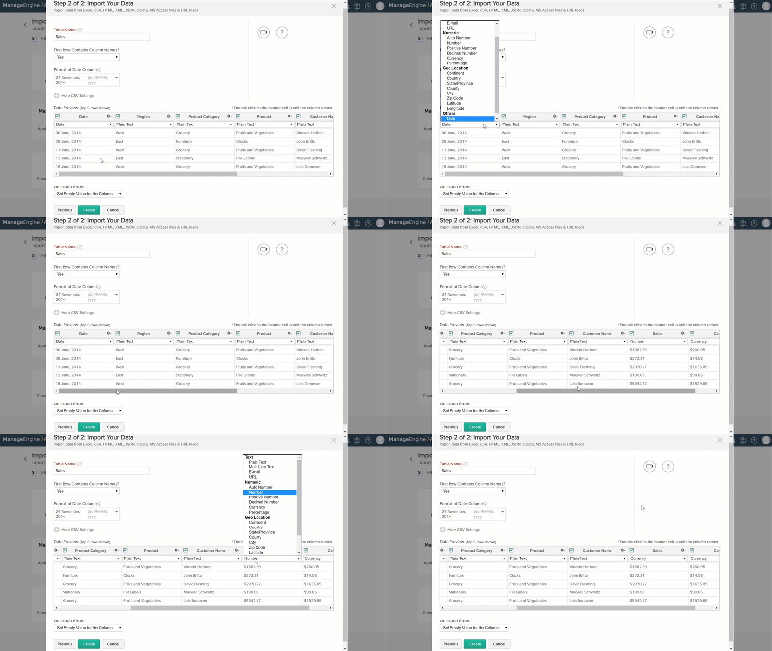
Analytics Plus automatically recognizes the data type of the columns in your spreadsheet or data table. For instance, when you import sales related data, Analytics Plus will automatically categorize your date, currency and plain text columns. Depending on the formating in your data source, there are chances that your currency column gets categorized as decimal. This could affect the way visualizations are generated.
It is a good practice to make sure data types are correct before importing all your data. You can change data type using the drop down in the data preview screen. It is important to get this right as it plays a big role in report creation and auto-analysis.
2. Handling date columns
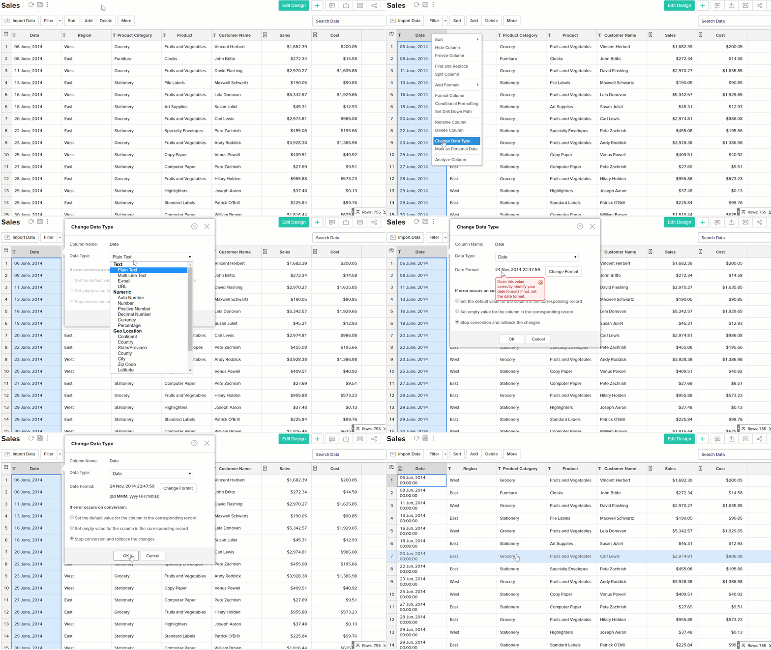
When you import data from multiple sources or keyed in by more than one user, there is always the possibility that columns like date may not be in the same format.
This could cause the application to categorize these columns are text columns. Use the Change data type option to change them back to date and select the appropriate date format. Your reports and dashboards will thank you for it.
3. Working with CSV files
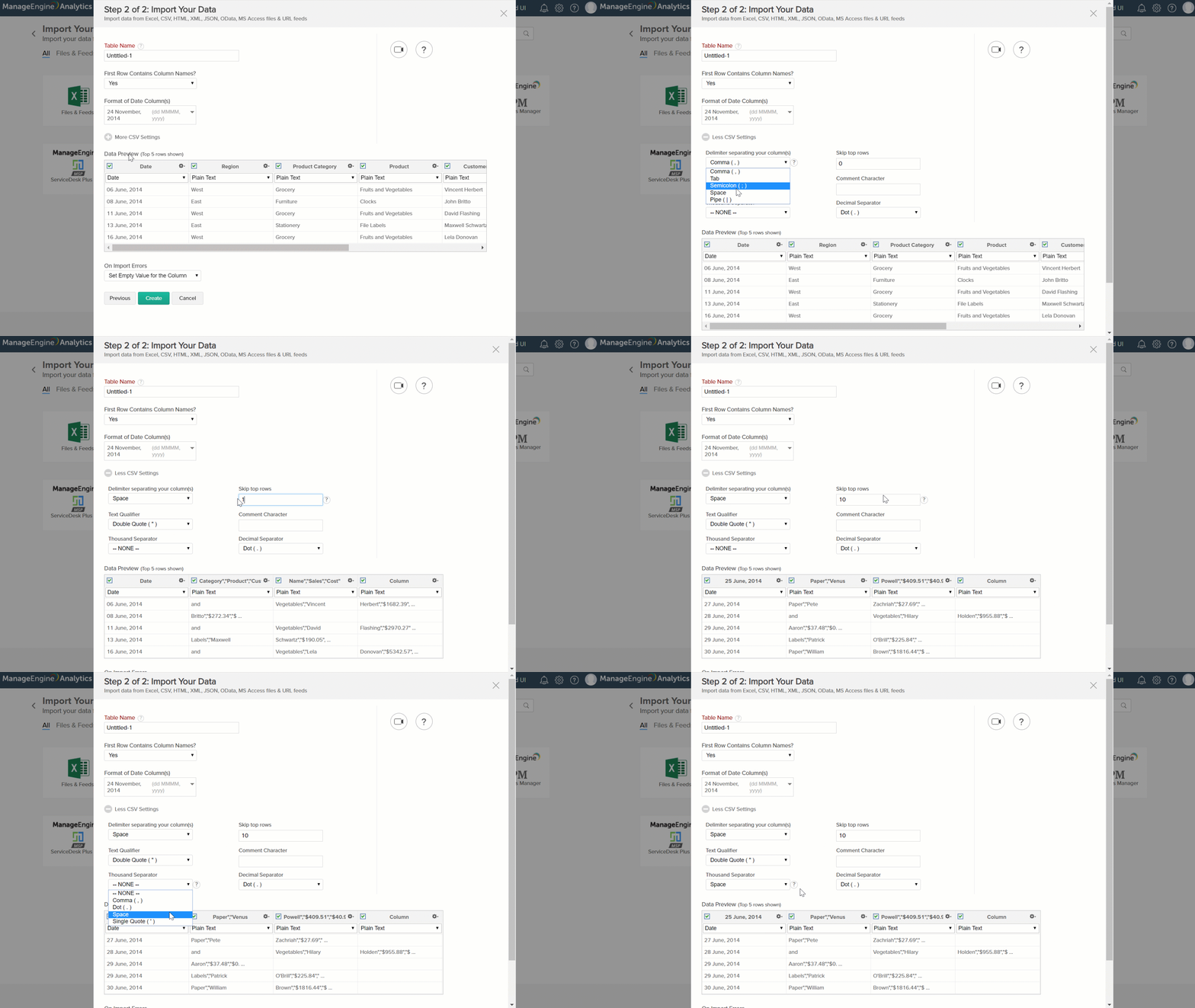
CSV files that you import may not always have comma (,) as the delimiter. Analytics Plus has you covered. Use the More CSV settings option to customize delimiters, skip rows etc., in your spreadsheet. These are options that will help you import clean data.
Data manipulation
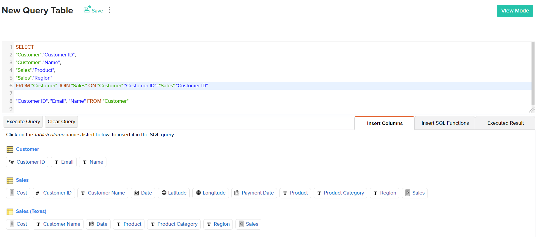
1. Query tables to join tables
Though Query tables can be used as one of the chart types, its purpose in Analytics Plus is to combine data from two different tables/data source. Use the output of the query table to build custom charts.
Query tables are useful in scenarios where you need to compare your sales data with marketing spend, to calculate your ROI (return on investment). You would need basic level SQL querying expertise to use this option.
2. Link tables using Lookup column
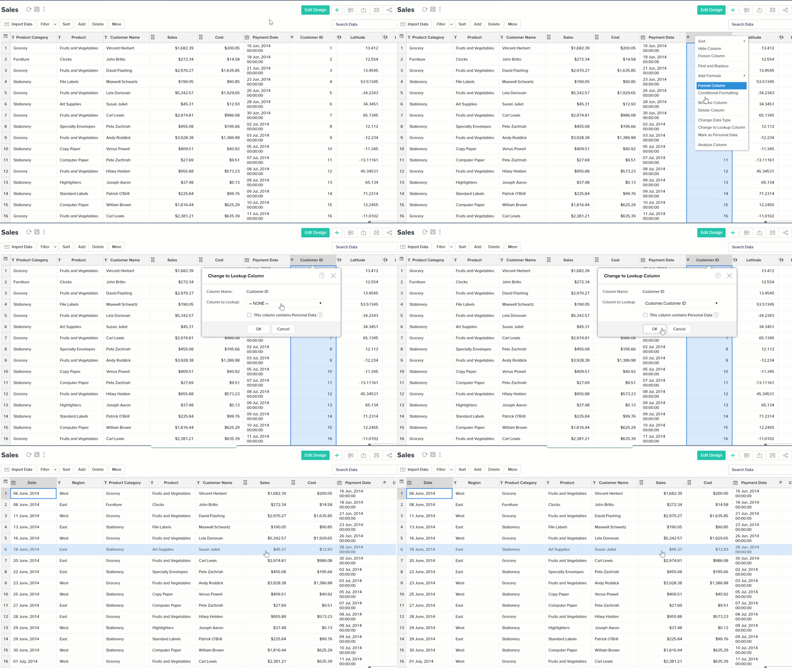
Lookup column option is a simple way to link two tables in your workspace. This is a good alternative to writing multiple SQL JOINS to combine data across tables. You can use the lookup option when you have two or more tables that contain a common, and unique column such as order number, invoice number, Request ID etc. Once tables are linked, you will be able to create reports by using columns/values from all the linked tables.
Simply right click on the intended column and select the column to lookup. Make sure the parent column you're looking up has unique, non-repetitive values.
3. Formula columns and Aggregate formulas
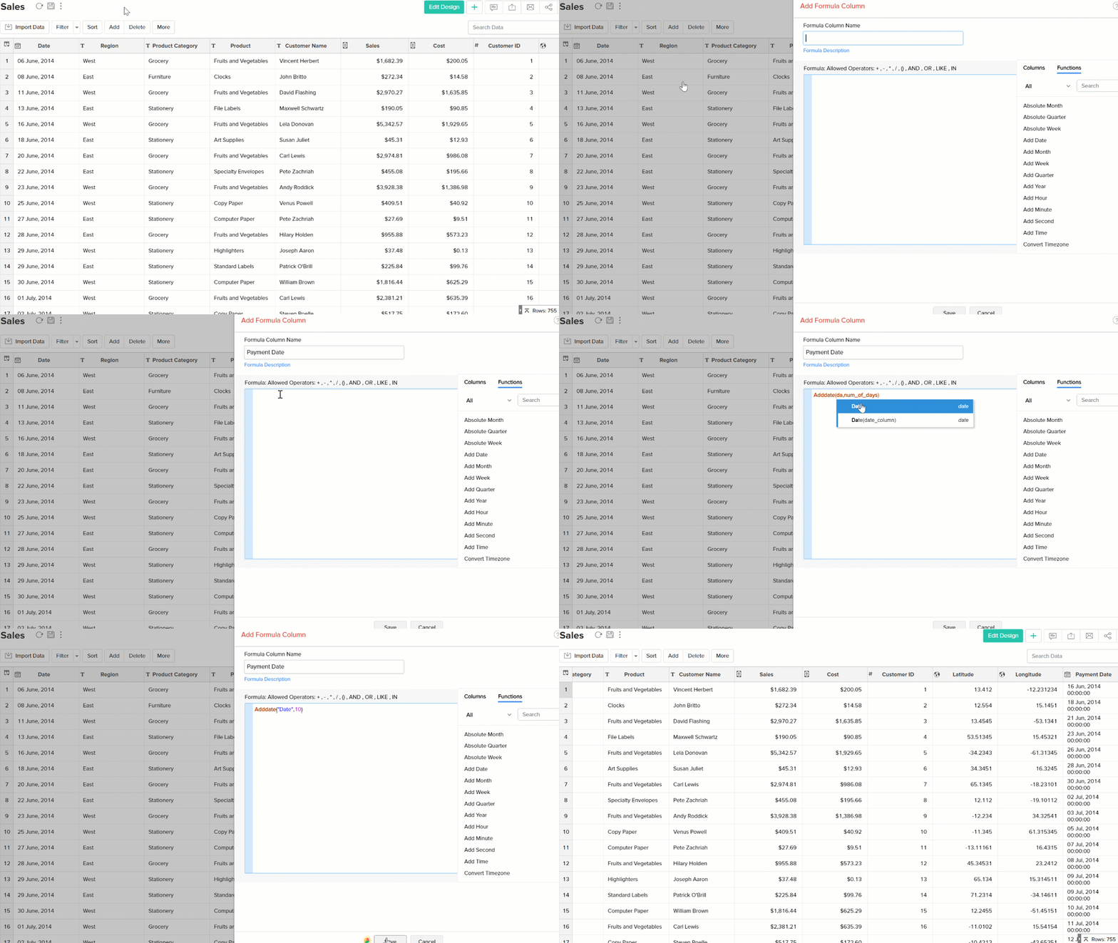
Formula columns can be used to get derived or calculated values from your raw data. Want to find out the time it took to dispatch an order? Create a formula column to subtract the date values of 'Order date' and 'Ship date'. There is a vast library of formulas to perform text, logical, date operations and more.
Aggregate formulas are useful for aggregating numeric data and deriving statistical values. Especially when you are trying to get statistical output like average, mean, median etc., of data values.
Here is an example you can figure out the percentage of escalated requests from the total number of requests using an aggregate formula.
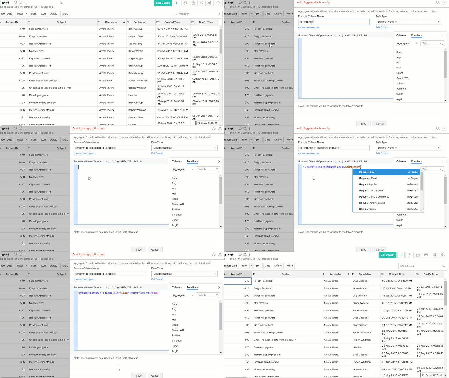
Tip: Formula columns create a new column with corresponding values for each row in the original column while aggregate formulas give a single value output. Aggregate calculations are not displayed in the table view, however, you can pick them from the column picker panel when you create new reports.
Report/Dashboard Creation
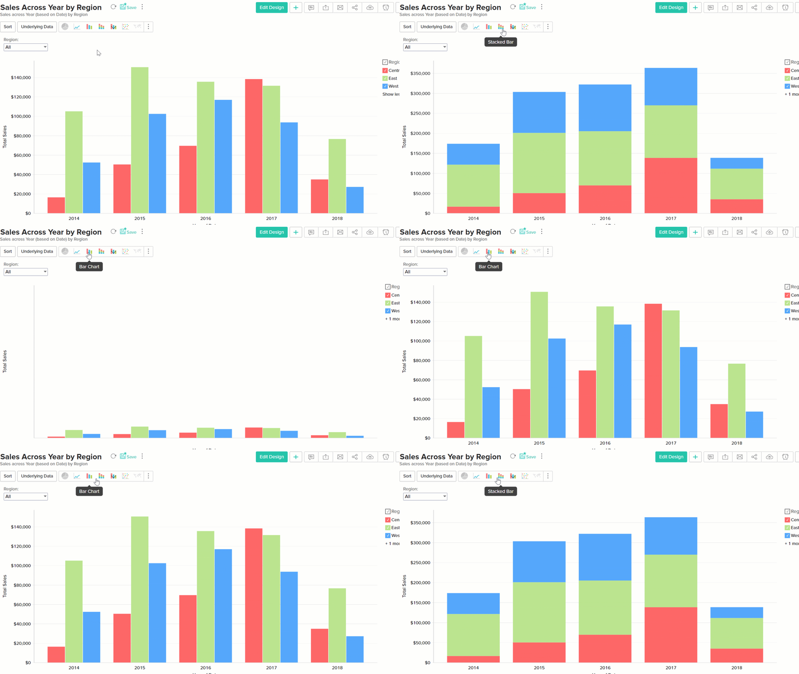
1. Stacked bars
Stacked bars make it easy to compare one value with another. The colors on the stack bar correspond to the values of the column dropped in the "Color" section of the report builder. In SLA violation analysis where you denote the priority of a ticket by the color, use stacked bars to understand the data better.
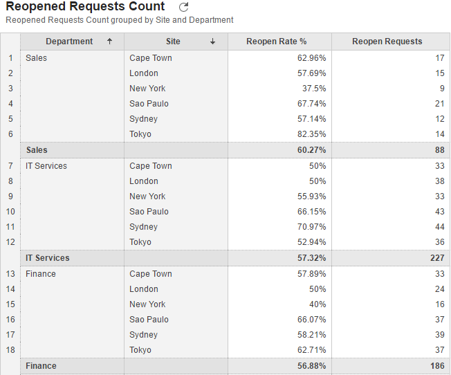
2. Pivot charts
Pivot charts can be used to create multi-dimensional reports when there is a need to compare more than 3 values . For example, a view displaying the request re-open rate and number of re-opens across multiple departments, and sites. Such detailed reports are difficult to represent in graphical format.
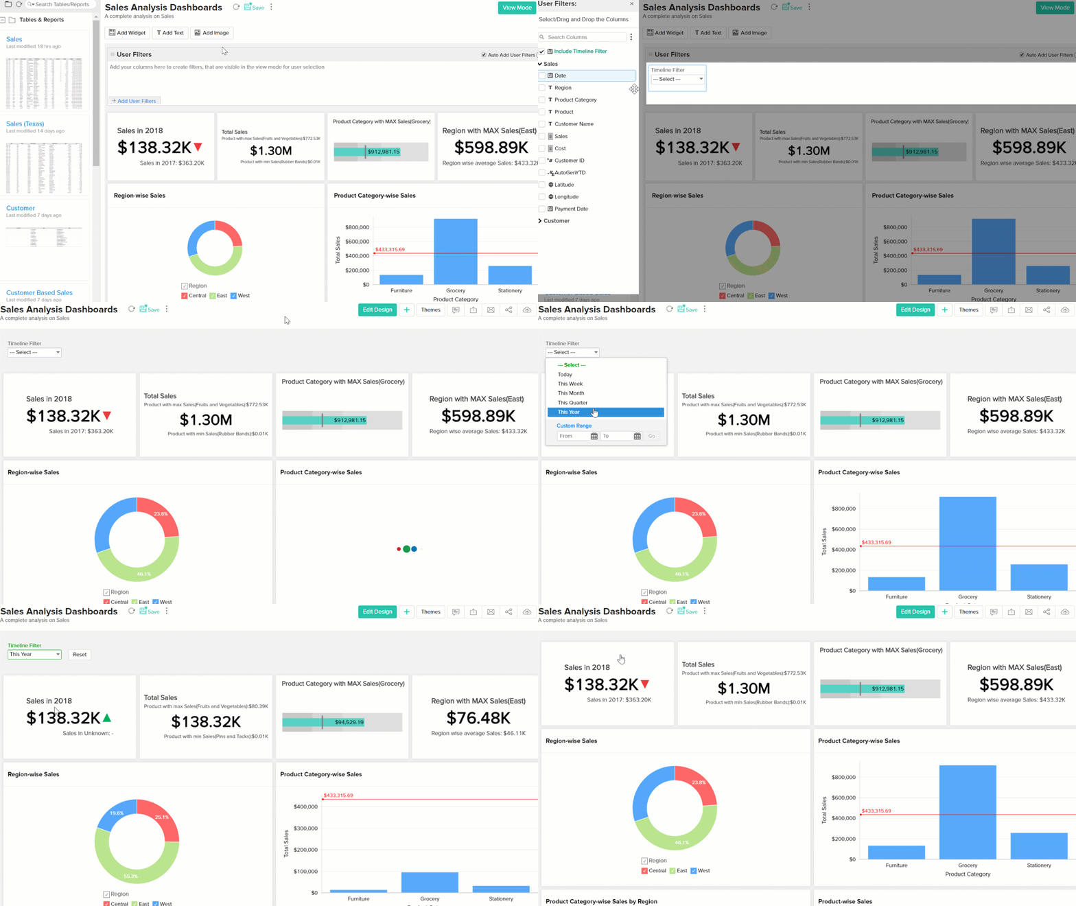
3. Timeline filters
Timeline filters apply to date values of all reports and widgets on a dashboard. Use timeline filters instead of adding a individual date columns as user filters in your dashboard.
Use timeline filters during presentations to show trends during different time periods.
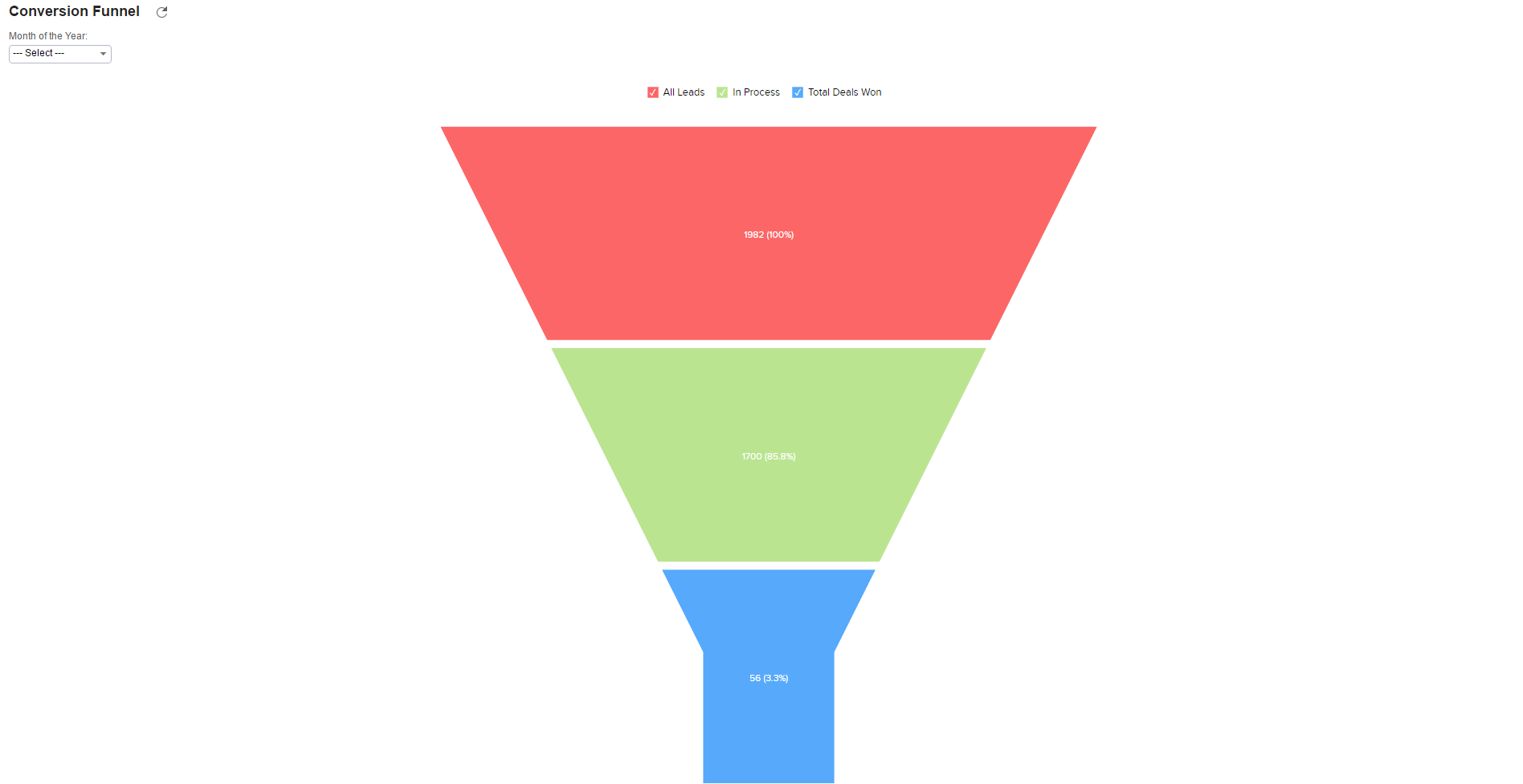
4. Funnel charts
Funnel charts are used to denote a process which starts at 100% and ends at a lower percentage. You can denote your sales process using a funnel chart, here the chart starts with the lead count at the top and then down to hot leads and then closed deals. This can be used to identify where the decline begins and at what rate it occurs. A larger difference in size between the sections will denote a higher rate of decline thereby implying a weaker area in the process.
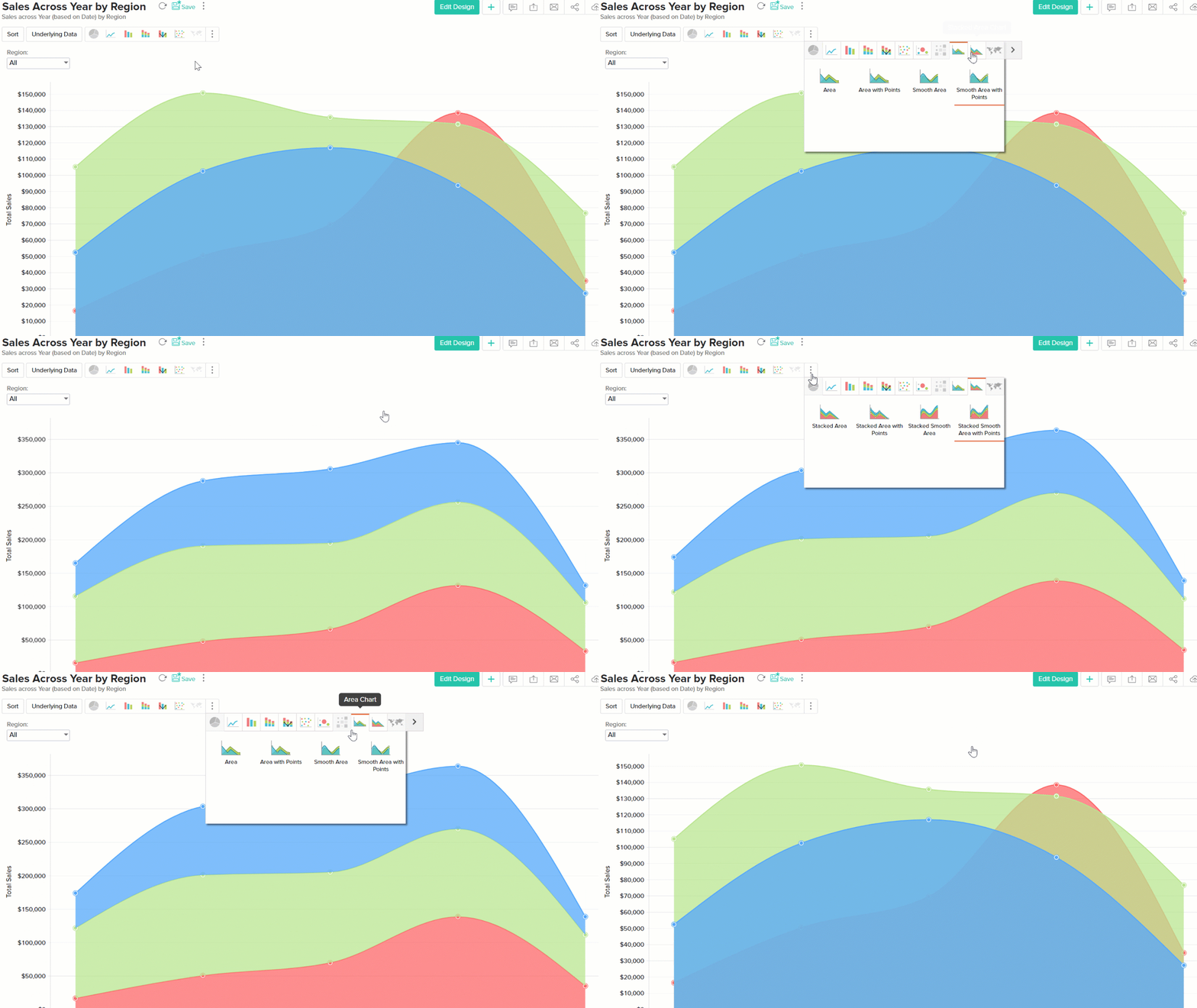
5. Stacked area charts
Stacked area charts are better compared to area charts for comparing trends across different categories. In cases where area charts become messy with too
much data, stacked area charts give you a better picture of the data.
6. Table relationship
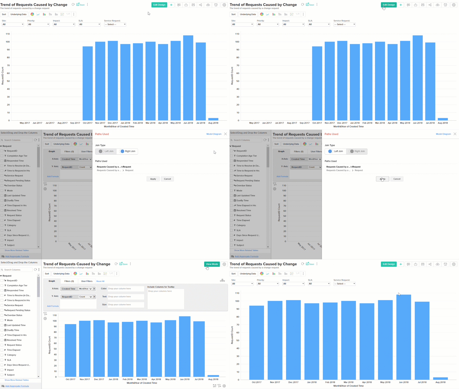
Use the Table Relationship pop-up to choose the correct type of join in order to avoid empty values in your report. This only applies to reports built using fields from multiple tables that are related using a lookup column. Choose the appropriate type of join (left or right) using the "Table Relationship" option on the top right corner.
7. Switching views
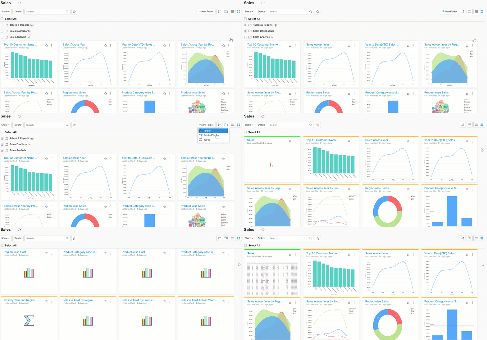
Sometimes it gets difficult to keep track of the several reports when you have a large number of tables, reports and dashboards . Switch to Related view on your "Explorer" window to group tables and their related reports together. Dashboards and reports will be listed right next to the table used to create them.
8. Setting thresholds
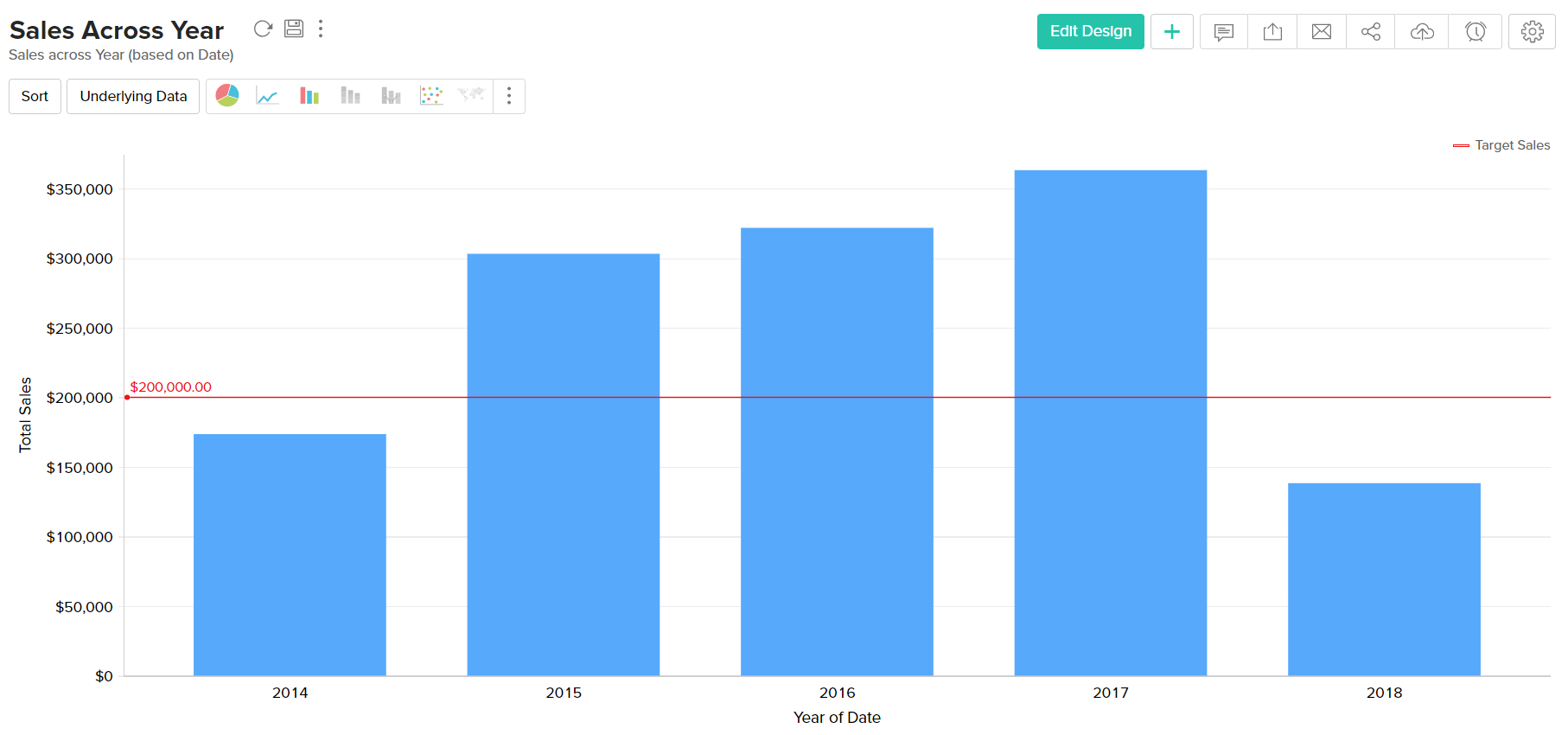
Most KPIs have thresholds, an accepted limit within which the respective KPI value is considered to be under control. This limit of course, varies from one company to the other. Some examples are resolution time SLAs, first response SLAs, server CPU utilization thresholds, traffic volume thresholds etc. Different types of notifications are triggered by your applications when these thresholds are breached, however, you don't see these thresholds in your reports.
Using the threshold feature in Analytics Plus, you can visually find out how compliant you are with respect to these established limits. You can set a threshold by
- Click on Settings.
- Click on Threshold tab.
- Set the required threshold.
9. Choosing fields in the column picker
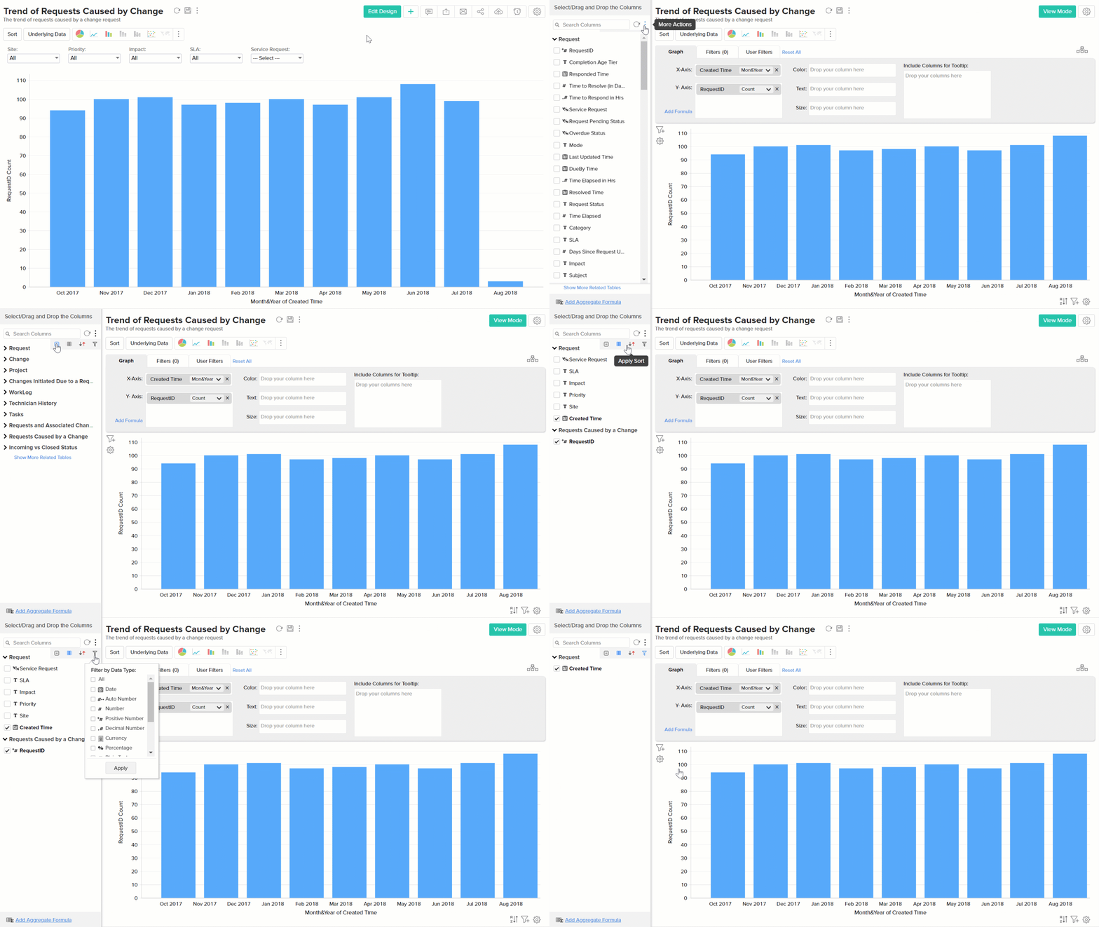
Building reports or charts would be a lot simpler if you had advanced search options for easy navigation. ManageEngine Analytics Plus offers a combination of searching, sorting, and filtering options to help you quickly find the fields you’re looking for.
In the report editor screen, there are four options in the column picker section that help you conveniently pick fields of your choice, without having to scroll down the entire list.
