Getting started with ZML
Being new to ZML, it can be hard for any user to know where and how to start. It's easy to get stuck somewhere wasting a lot of your time and efforts (and of course, Money!). The aim of this guide is to show you ‘how’ to create your first panel without focusing too much on the “why.” By the end of this, you will have the know-how to create a basic panel and we hope that this will inspire you to delve further into the ZML.
Overview
A ZML snippet is generally used to construct a panel component along with some business logic (that can be achieved by combining Deluge). Following is the essential structure of a panel in ZML.
Each panel must contain:
- <panel> Tag: The <panel> tag defines the primary container-like structure that holds some data.
- <pr> Tag: The <pr> tag or panel-row defines a logical row within every panel.
- <pc> Tag: The <pc> tag or the panel-column defines a logical column within every <pr>.
- Panel Element: Panel elements include, text, image or a button. Every panel can hold one or more of these elements in it.
Deconstructing the structure of a panel
Now that the structure of a panel is defined, we need to understand how each element contributes to forming a complete panel with some content and business logic in it.
The image given above gives a 3-D view of the different layers of a ZML panel. There are three logical layers that form a panel. As defined in the structure of a panel, the <panel> tag defines the primary container. Followed by <pr> and <pr> which are the logical rows and columns that are not visible.
Panel rows and panel columns help organise elements in a panel. This means that each element like a text, image or button is enclosed within a cell-like container which facilitates adding style and arrange each element individually.
Building a panel in ZML
Let us consider the panel in the image below and build it in parts using a top-down approach.
This panel is a collection of:
- Text Data - Static and Fetched Data
- Background Color and Text Positioning
- Two Columns
- Image - Icons
- An action associated text
Step 1: Creating a panel and adding a simple text content in it:
Here's how a simple ZML panel will show up on your page:

To create a simple panel:
<pr height='fill' width='fill'>
<pc width='100%' bgColor='#FFFFFF' padding='20px'>
<text value='Projects' size='4' color='#000000'> </text>
</pc>
</pr>
</panel>
Step 2: Aligning the text content:
Output after aligning text:

To align text in a panel:
<pr height='fill' width='fill'>
<pc width='100%' bgColor='#FFFFFF' padding='20px' hAlign="left">
<text value='Projects' size='4' color='#000000'> </text>
</pc>
</pr>
</panel>
Step 3: Displaying text data fetched from an application:
Output:

To display application data (text) in a panel:
<pr height='fill' width='fill'>
<pc width='80%' padding='20px' hAlign='left'>
<text type='Text' value='Projects' size='4' textAlign='left'> </text>
</pc>
<pc width='20%' padding='20px' hAlign='right'>
<text type='Form Data' value='thisapp.New_Project.ID.count' size='8' bold='true'> </text>
</pc>
</pr>
</panel>
Step 4: Adding a background color to the panel:
Output:

<panel>
<pr height='fill' width='fill'>
<pc width='80%' bgColor='#20B2E3' padding='20px' hAlign='left'>
<text type='Text' value='Projects' size='4' color='#FFFFFF' textAlign='left'> </text>
</pc>
<pc width='20%' bgColor='#20B2E3' padding='20px' hAlign='right'>
<text type='Form Data' value='thisapp.New_Project.ID.count' size='8' color='#FFFFFF' bold='true'> </text>
</pc>
</pr>
</panel>
Step 5: Adding more rows within the panel and adding an image/icon:
Output: The icon here is '>' symbol
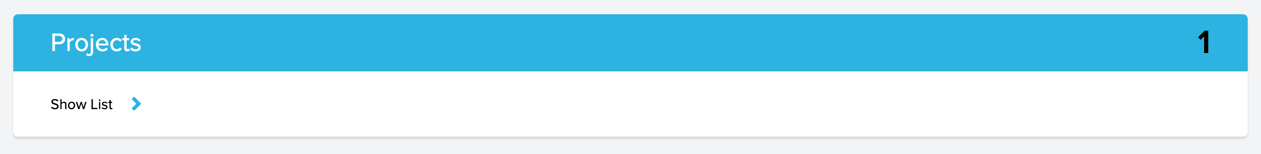
<pr height='fill' width='fill'>
<pc width='100%'>
<pr height='fill' width='fill'>
<pc width='80%' bgColor='#20B2E3' paddingTop='10px' paddingLeft='40px' paddingRight='10px' paddingBottom='10px' hAlign='left'>
<text type='Text' value='Projects' size='6' color='#FFFFFF' textAlign='left'> </text>
</pc>
<pc width='20%' bgColor='#20B2E3' paddingTop='10px' paddingLeft='10px' paddingRight='40px' paddingBottom='10px' hAlign='right'>
<text type='Form Data' value='thisapp.New_Product.ID.count' size='8' bold='true'></text>
</pc>
</pr>
<pr height='fill' width='fill'>
<pc width='100%' paddingTop='10px' paddingLeft='40px' paddingRight='10px' paddingBottom='10px' hAlign='left'>
<pr height='auto' width='auto'>
<pc>
<text type='Text' value='Show List' size='3' textAlign='left'> </text>
</pc>
<pc>
<image color='#20B2E3' bgColor='#FFFFFF' width='52px' height='52px' type='icon' value='arrows-1-bold-right' size='1' cornerRadius='10px' iconType='solid' /> </pc>
</pr>
</pc>
</pr>
</pc>
</pr>
</panel>
Step 6: Complete Panel with text,image and actions:
Output:
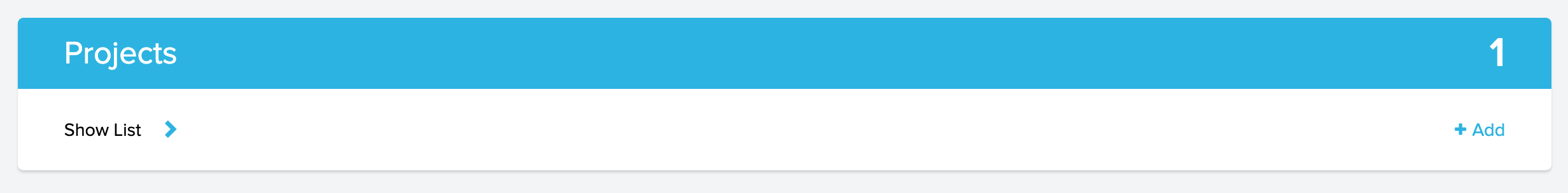
<pr height='fill' width='fill'>
<pc width='100%'>
<pr height='fill' width='fill'>
<pc width='80%' bgColor='#20B2E3' paddingTop='10px' paddingLeft='40px' paddingRight='10px' paddingBottom='10px' hAlign='left'>
<pr height='auto' width='auto'>
<pc>
<text type='Text' value='Projects' size='6' color='#FFFFFF' textAlign='left'> </text>
</pc>
</pr>
</pc>
<pc width='20%' bgColor='#20B2E3' paddingTop='10px' paddingLeft='10px' paddingRight='40px' paddingBottom='10px' hAlign='right'>
<pr height='auto' width='auto'>
<pc>
<text type='Form Data' value='thisapp.New_Product.ID.count' size='8' color='#FFFFFF' bold='true' textAlign='right' displayType='actual'> </text>
</pc>
</pr>
</pc>
</pr>
<pr height='fill' width='fill'>
<pc width='60%' paddingTop='10px' paddingLeft='40px' paddingRight='10px' paddingBottom='10px' hAlign='left'>
<pr height='auto' width='auto'>
<pc>
<text value='Show List' size='3'> </text>
</pc>
<pc>
<image color='#20B2E3' bgColor='#FFFFFF' width='52px' height='52px' type='icon' value='arrows-1-bold-right' size='1' cornerRadius='10px' action='OpenForm' componentLinkName='New_Product' target='new-window' iconType='solid' /> </pc>
</pr>
</pc>
<pc width='40%' paddingTop='10px' paddingLeft='10px' paddingRight='40px' paddingBottom='10px' hAlign='right'>
<pr height='auto' width='auto'>
<pc>
<image color='#20B2E3' bgColor='#FFFFFF' width='20px' height='18px' type='icon' value='ui-2-fat-add' size='1' cornerRadius='0px' iconType='solid' /> </pc>
<pc>
<text value='Add' size='3' color='#20B2E3' bgColor='#FFFFFF'> </text>
</pc>
</pr>
</pc>
</pr>
</pc>
</pr>
</panel>
Additional functionalities
In addition to the above, you can add a custom function from any of your applications to an action.
To associate a custom function to an action:
<pr height='fill' width='fill'>
<pc width='100%' bgColor='#FFFFFF' padding='20px'> <text type='Text' value='Projects' size='6' color='#FFFFFF' textAlign='left' action='Function' functionName='leadDetails.getLeadName' parameters=''${view}''> </text>
</pc>
</pr>
</panel>