Zia Anomaly Report
CloudSpend's AI-powered Zia framework for anomaly report helps to detect any unusual spikes or aberrations in your cloud cost. The Zia Anomaly Report helps you fine-tune your cloud bills and safeguard your cloud infrastructure from any unforeseen issues. You can share anomalies with your team either by generating a CSV, PDF or via email.
Why the Zia Anomaly Report?
The idea behind anomaly detection in cloud costs is to identify any unusual spikes or aberrations in a given date range. CloudSpend uses artificial intelligence (AI) to detect anomalies as soon as they occur. It collects and analyzes the cloud cost of the past 180 days to predict any unusual spikes in your cloud costs.
You can leverage the following benefits with the Zia Anomaly Report:
- Obtain a granular view of the anomalies in cost detected for your cloud accounts.
- Identify unusual spikes in your cloud costs, and take proactive decisions to avoid cost overruns.
- Get critical insights about the cost anomaly with a detailed root cause analysis.
Interpreting the Zia Anomaly Report
The Zia Anomaly Report lets you seamlessly view and interpret the anomalies identified in your cost accounts.
Follow the steps below to view the Zia Anomaly Report:
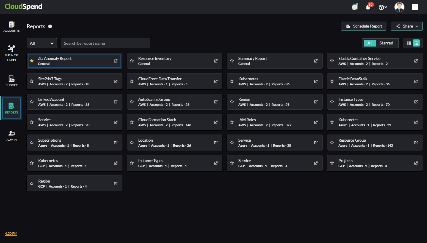
- Log in to CloudSpend Reports.
- Select Zia Anomaly Report.
Summary
The Summary page displays the anomaly summary details based on the report category for different cloud types in a tabular or pie chart format.
You can filter the anomalies based on the following categories:
- Open: If you choose the Open filter, the list of open anomalies will be displayed for various report categories. The open anomalies will be displayed by default.
- False Positive: The False Positive filter shows the list of anomalies that were detected as false positives. You can review and change the status of a False Positive anomaly to Acknowledged.
- Acknowledged: You can view the list of anomalies that were identified as legitimate with the Acknowledged option. You can change the status of an anomaly marked as Acknowledged to False Positive.
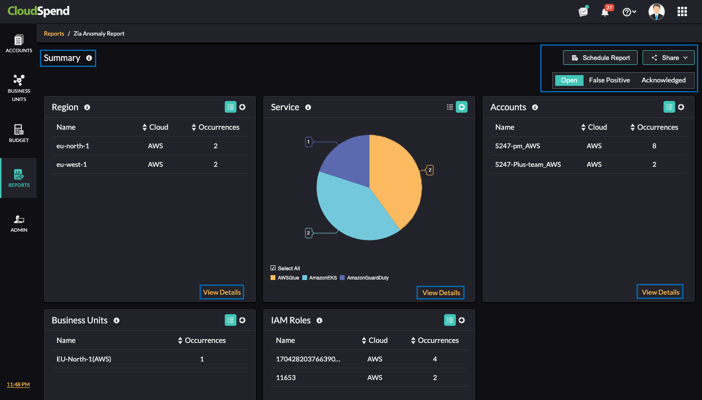
If you click View Details in each report category section, the Category page will be displayed. Click the entity to get critical insights about the respective anomaly.
Category
The Category page displays the list of report category entities that have experienced an anomaly. Click the applicable entity to get critical insights and analyze the detected anomalies.
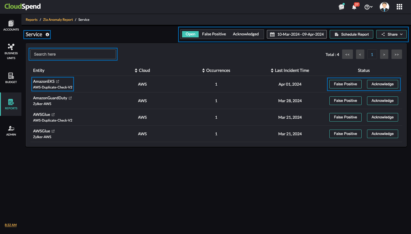
You can search for the required entity by entering the entity name in the search bar at the top of the page. A custom date range can be set by using the date filter in the top-right corner and view the anomalies that occurred during the specified date range. Additionally, you can filter and view the list of Open, False Positive, and Acknowledged anomalies.
To obtain a detailed breakdown of the anomaly detected for each entity, click the entity name to open the Anomaly Report page. If an anomaly is identified as a false positive for an entity, click False Positive next to the respective entity. If the anomaly is legitimate, click Acknowledge.
To schedule a report, click Schedule Report. To share the report with your team, click Share and select the required format.
Anomaly Report
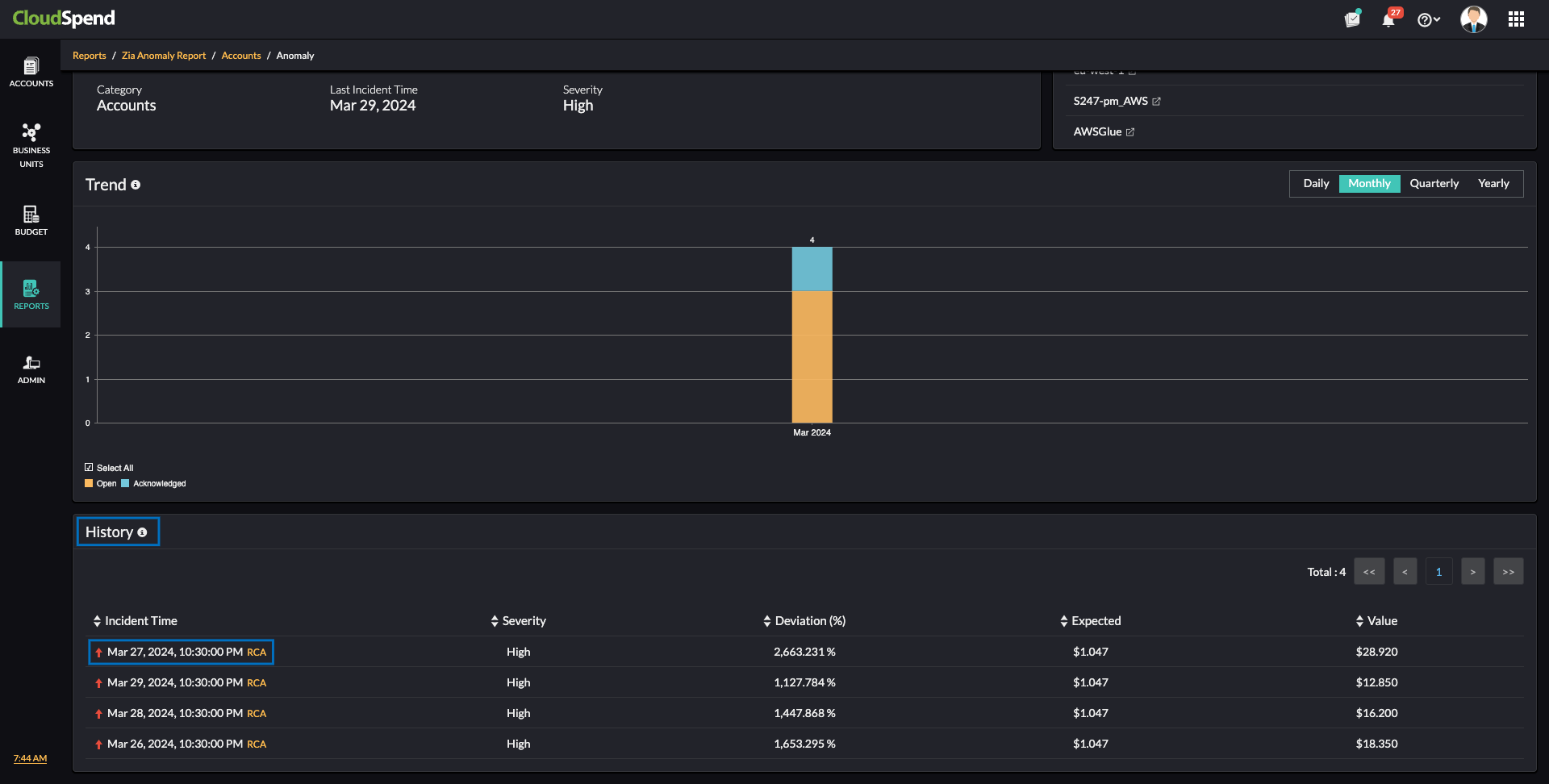
Obtain deep insights about the anomaly identified, including details such as Occurrences, Cloud type, Category, Last Incident Time, and Severity from the Anomaly page. You can also view similar anomalies identified in various report categories from this page. Furthermore, you have the option to schedule and share the report.
A graphical representation of all the Open, False Positive, and Acknowledged anomalies is also displayed. You can get details like Last Incident Time, Severity, Deviation, and Expected values from the Anomaly page.
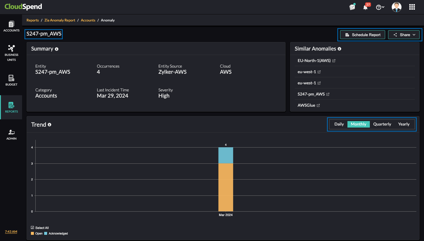
Click the applicable Incident Time to view the Root Cause Analysis page. Alternatively, you can click RCA to view the Root Cause Analysis page.
Root Cause Analysis
The Root Cause Analysis page provides in-depth details about the anomaly trend. Click Share in the top-right corner to export the report in PDF format and email it to your team.
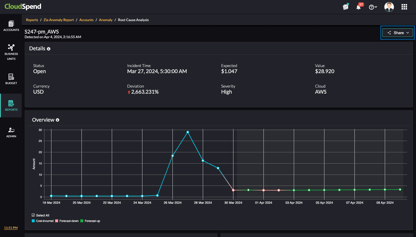
The Root Cause Analysis page includes the following sections:
- Details: Get insights about the anomaly detected for the entity. You can view details such as Status, Incident Time, Deviation, Level, and Cloud.
- Overview: This section provides a graphical representation of the cost incurred and the forecast values. The blue line indicates the cost incurred, the peach line indicates a high forecast value, and a green line indicates a low forecast value.
- Cost: The cloud cost incurred during the period of the detected anomaly is displayed in the Cost section.
- Forecast: The cloud cost is forecasted based on the spending pattern during the period of the detected anomaly.
The Root Cause Analysis page also includes the following widgets:
- Historical Average($): The average cost calculated based on spending from the past six months. The date range for calculating the value starts from the beginning of the month when the anomaly happened and ends on the specific date when the anomaly occurred.
For example, if an anomaly is detected for a cost account on Oct. 15, the date range for comparison will be from Oct. 1-15. CloudSpend calculates the average cost for that specific date range across the past six months (e.g., Sept. 1—15, Aug. 1—15, etc.) for the same account. This helps you understand typical spending for that time period. If the average cost over the last six months for this date range is $10,000, but the current anomaly shows a cost of $15,000, then it proves that there is a clear deviation. - Cost($): The actual expenditure during the anomaly period.
- Variance: The number of new resources that contributed to the anomaly and its percentage.
Imagine you noticed an October cost anomaly for one of your cost accounts, where expenses rose by 50%. The Variance widget shows that three new resources were added during this time, contributing to the increase. These new resources made up 20% of the 50% increase. This means that 20% of the cost spike came from the new resources, while the remaining 30% was due to existing resources or other factors. This breakdown helps you understand the specific impact of the new resources on the overall anomaly, enabling you to evaluate whether these additions were justified or further actions are needed to manage costs more effectively. - Top Contributors($): The top resources contributing to the anomaly cost. A maximum of 100 resources will be displayed.
- Top Resources - Provisioned($): The most costly provisioned resources during the anomaly period. A maximum of 100 resources will be displayed.
Say an unusual spike of $15,000 was detected for a cost account between Oct. 1-15. The Top Resources - Provisioned($) widget reveals that from Oct. 1-15, an EC2 instance, a managed database, and an S3 bucket were provisioned and contributed significantly to the overall anomaly. The EC2 instances accounted for $5,000, the database for $3,000, and the storage bucket for $2,000 of the total $15,000 anomaly cost. This insight helps you to identify which resources were the main cost drivers during the anomaly period. With this information, you can assess if the provisioning of these resources was necessary or take actions to optimize their usage and reduce costs.
Related Topics