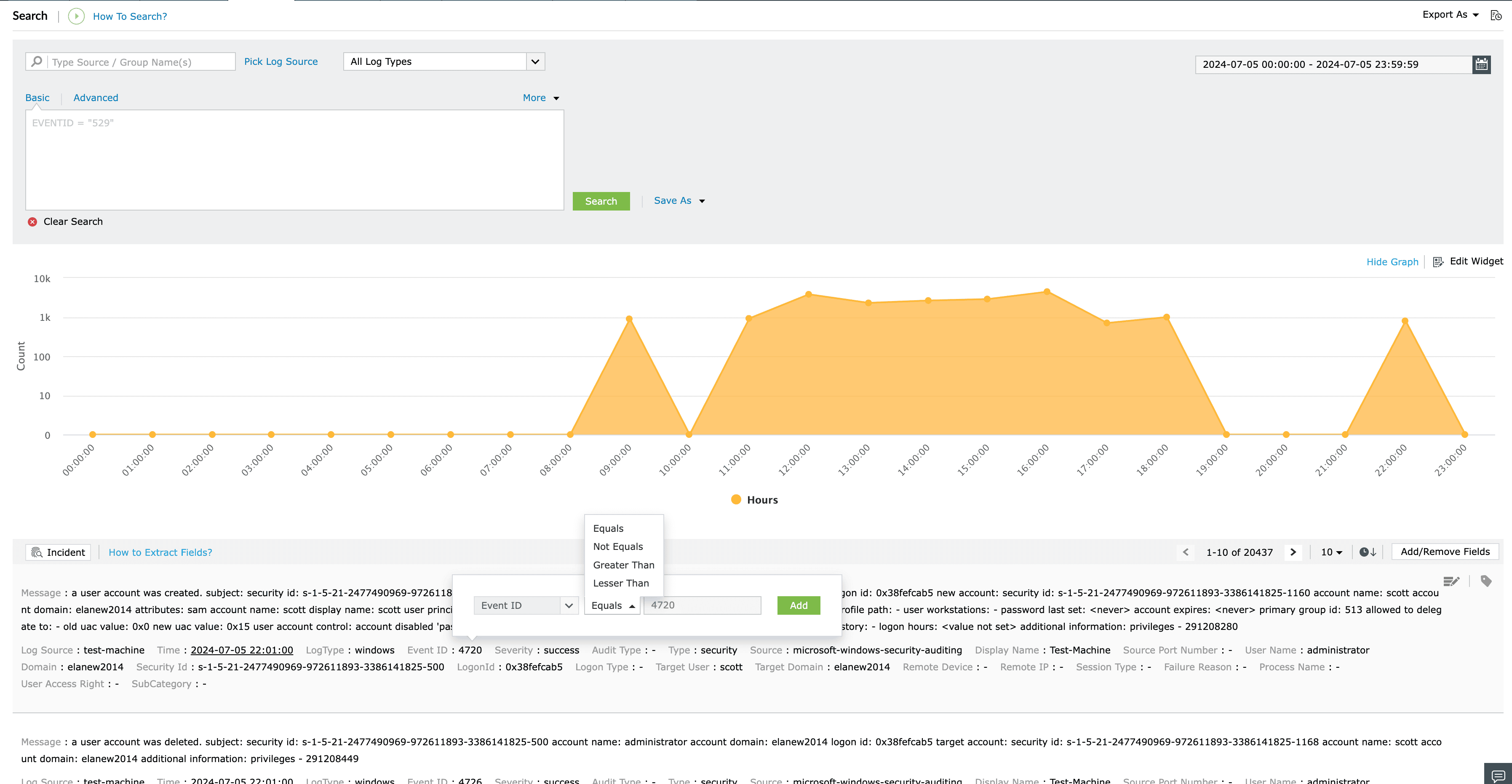
After clicking on Edit Widget, you can choose graph type, chart type and graph color and the changes will be reflected accordingly.

To drill down to a specific time range, simply click on a point on the graph. When you do this, the calendar will automatically adjust to display the corresponding time period. Both the table and the graph will also dynamically update to reflect the selected time range.
When you choose a specific section of the graph by dragging the cursor, the table will automatically adjust to show data within that time range, and the graph will be highlighted according to its chart type. You'll also notice an option to clear the selection becomes available. It's important to note that in this case, the chosen time range will not be updated in the calendar.

As you drag your cursor over a specific area of the graph, that portion will be highlighted, and the logs within that time range will be displayed.
You can now click on a field in table rows, triggering a UI popup where you can select criteria based on your requirements.

You can fetch logs before or after a specific time by selecting the time field in the table rows. The selected time will also be updated in the calendar.

You can now sort the table by time as a sorting field.

You can now save the search as an alert by clicking the "Save as Alert" option. This will redirect you to the Alerts tab along with the data from the Search page.

To look at the logs in a formatted view, click on the formatted view icon as shown below. Currently, formatted view is only available for cloud-source logs such as AWS CloudTrail, M365 General, etc.
