Add style to button
You can add custom styles to every button. Styling options for a button include customizing the label, adding color to the button and the text inside it, and specifying margin dimensions around the button.
To add style to a button in your page,
- Edit your app.
- Select the required page from the accordion menu on the top-left corner, or from the application preview in the middle. You'll be taken to its Design page.
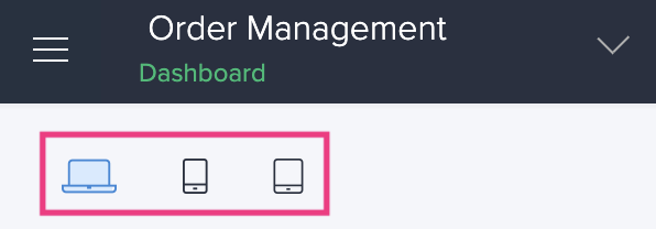
- Click on the device icon to navigate to the Design view of the device of your choice.

- Hover in the middle and click Open Page Builder.
- Click to select a panel that holds the button you want to customize.
- Click the Configure option in the toolbar in the header area of the page builder. The Panel configuration pane slides in.
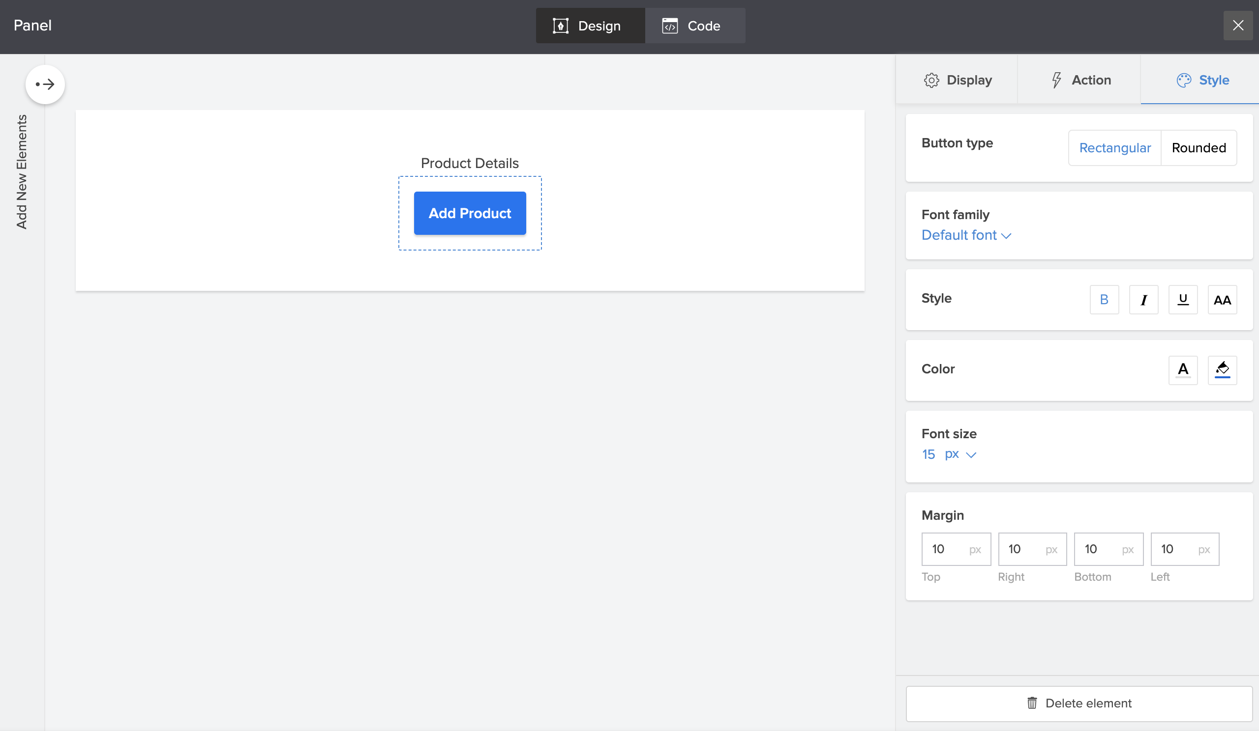
- Select Style from the configuration options on the right.
- Choose from the style options:
- Button type: Select the button shape as rectangular or rounded.
- Change font for button label: Click the Font family dropdown to select a font style.
- Set text style for button label: Click the B, I or U icon to Bold, Italicise and Underline respectively. You can also change the button text to uppercase by clicking the change to uppercase icon.
- Change font and button color:
- Click the font color picker icon to select a font color.
- Click the color palette icon to select a button color.
- Set font size: Specify the required font size or choose one from the dropdown.
- Set margin for button: Specify a margin in pixels for all four sides of the button.
- You can preview the changes and close the configuration sheet. The changes will be auto saved.
