Add style to gauge element in your page
Set color for the gauge elements
- Edit your app.
- Select the required page from the accordion menu on the top-left corner, or from the application preview in the middle. You'll be taken to its Design page.
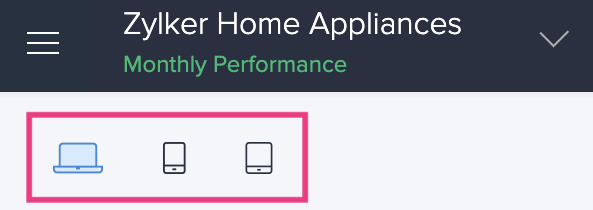
- Click on the device icon to navigate to the Design view of the device of your choice.

- Hover in the middle and click Open Page Builder.
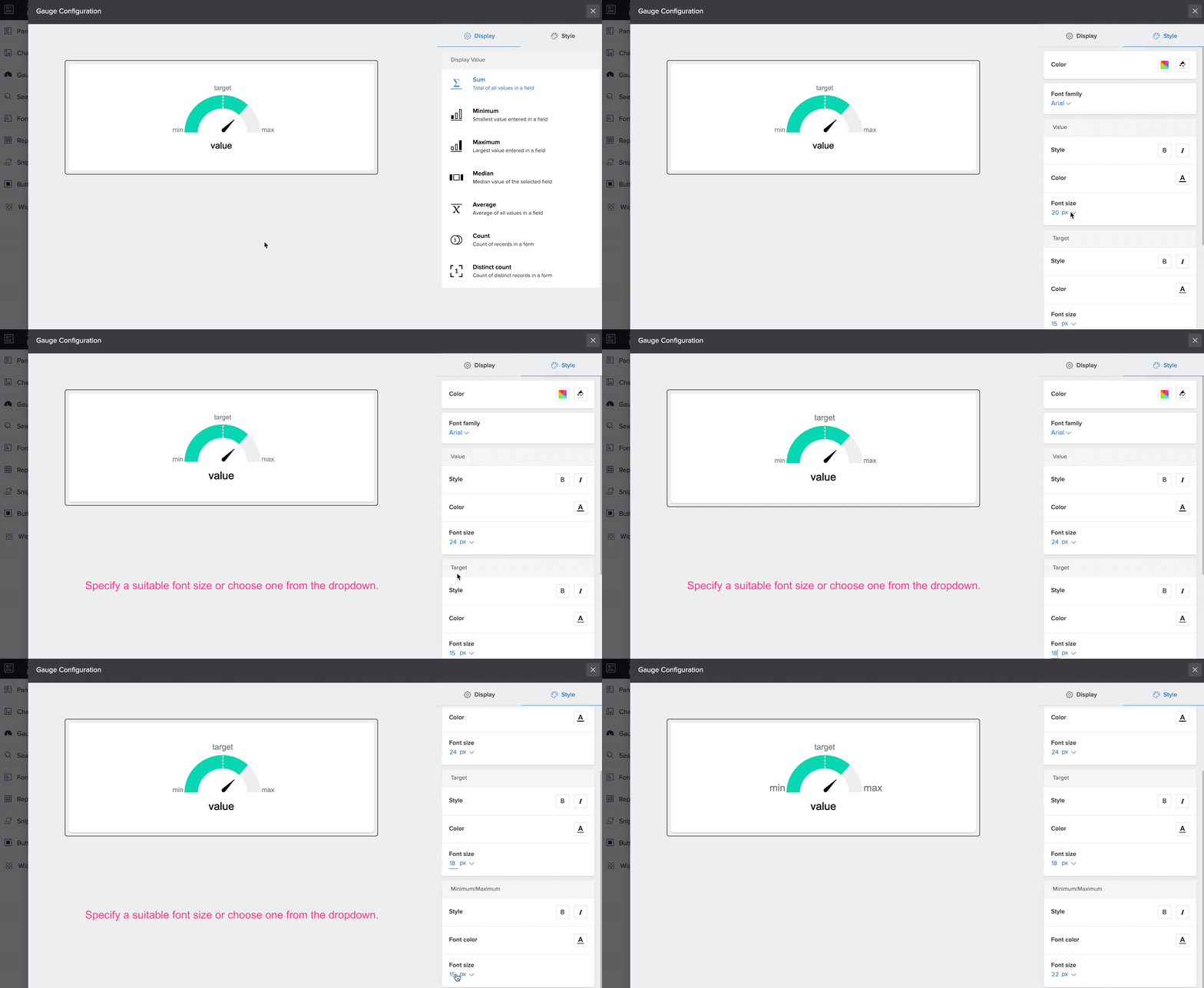
- Click to select the required gauge element and click Configure at the top of the page builder. You can also double-click the gauge element to open the Gauge Configuration pane that will slide in from the right.
- Click the Style tab on the top right of the configuration menu.
- Click the color-picker icon and select a default color for the gauge range. You can also choose different colors for the ranges, target and needle elements of the gauge by clicking the Advanced options.
- Click the color-picker (bucket-shaped) icon to set a background color for the panel in which the gauge is placed.
- The changes will be automatically saved.
Add style for the gauge elements
- Under the Value section, you can customize the style, font-color and font-size of the display data type chosen for your gauge.
- Under the Target section, you can customize the style, font-color and font-size for your gauge target.
- Under the Minimum/Maximum section, you can customize the style, font-color and font-size of the display data type chosen for your gauge ranges — minimum and maximum values.
