Understand panel builder
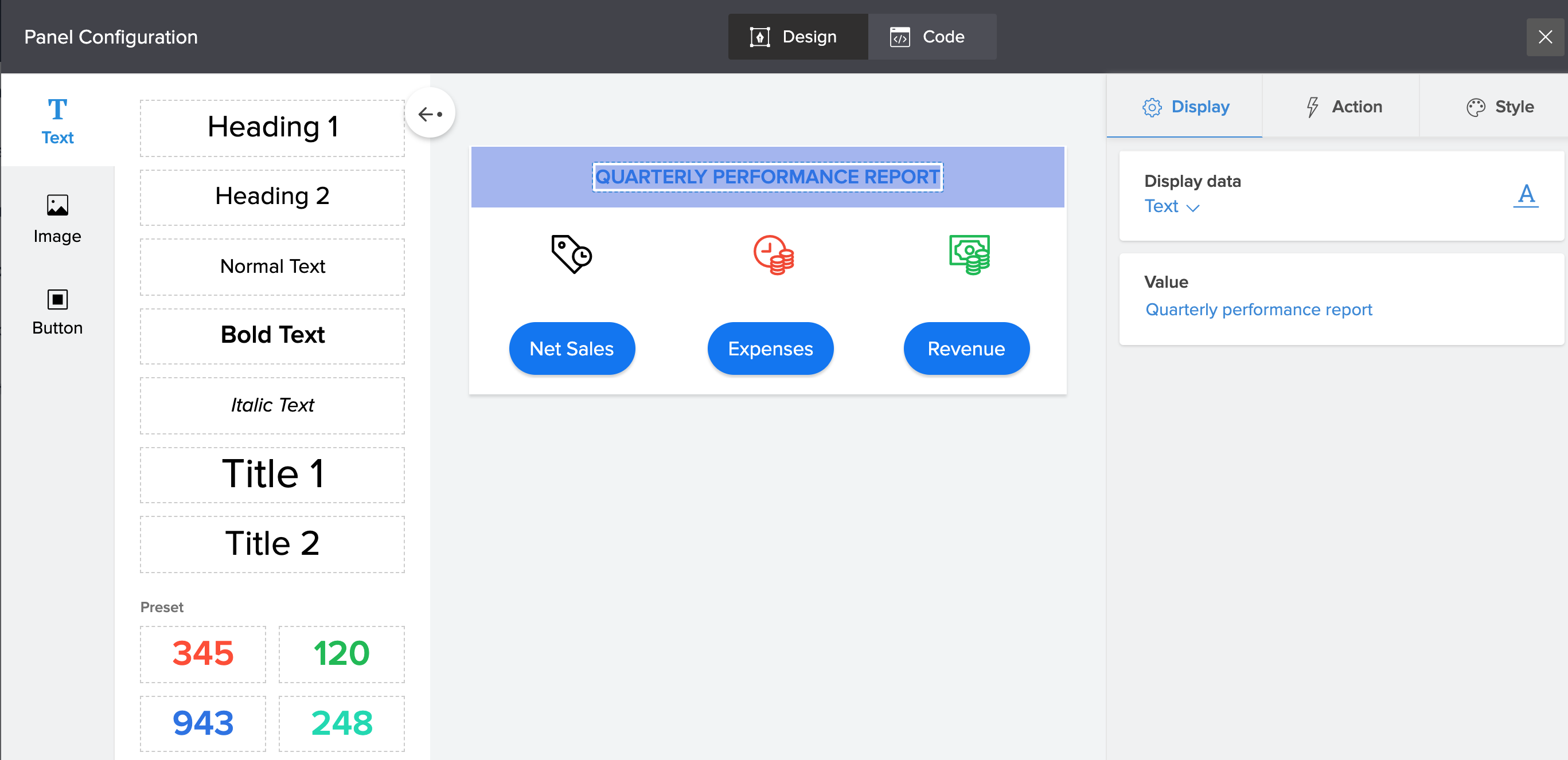
Panel builder is a tool that makes it possible to design any type of panel for your application page. With its user-friendly drag and drop interface and prebuilt elements that can be customized, you can create intuitive panels that are informative and visually beautiful.

Panel builder assists you in:
- Adding elements like buttons, images and texts to a panel.
- Configuring the display content's value for each of these elements.
- Adding action to each of these elements.
- Adding custom style to each of these elements.
- Reordering and repositioning of these elements within the panel.
How to reach the panel builder?
In the page builder, the first thing you’ll notice on the left side menu is the PANEL tab. The PANEL tab shows a default set of pre-built panel templates you can use for your page. Scroll through the available templates until you find one you’d like to use. You can apply panel filters to refine your search. To pick the chosen panel, simply click, drag and drop it on your builder. The slider that now floats in from the right is the Panel Builder. You can now customize and format any of the existing elements on the panel. In the panel builder, mix and match new elements, add style and action to create your own customized panel design.
To help you get familiarized, here are the most basic parts of the panel builder:

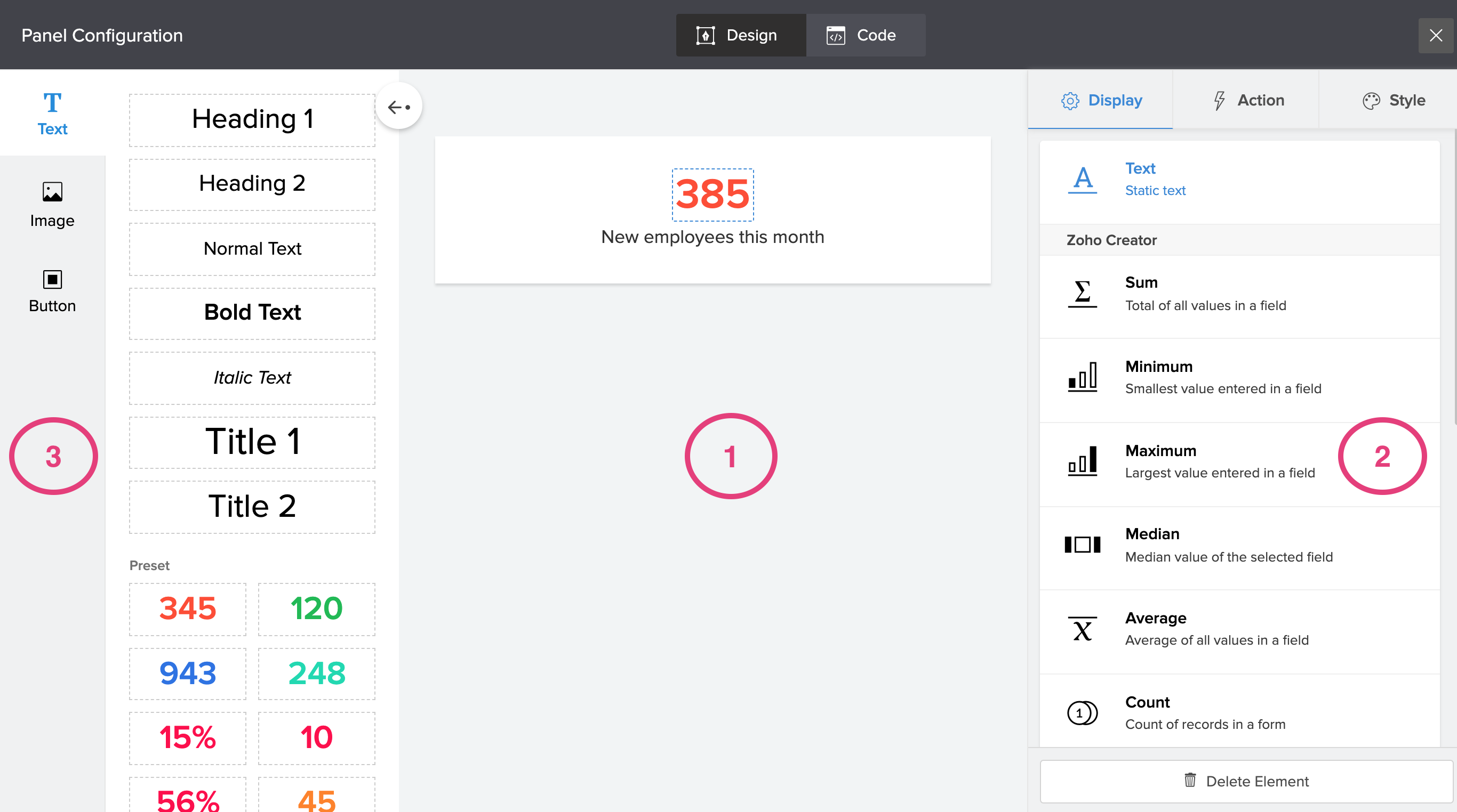
- Builder area: The Builder area of the panel builder is a space in the middle that allows you to arrange various components on a panel using a drag-and-drop editor and previewing your changes.
- Configuration menu: The menu on the right side of the panel builder is the configuration menu. You can add display content, action and style to each of your panel's element from here.
- Elements menu: The menu on the left side of the builder which usually opens up on clicking the arrow button, provides various options for text, image and button styles.
You can add, duplicate, delete, or reorder the elements of the panel using the controls displayed in the panel builder.