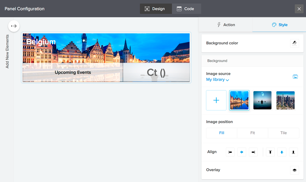
Set background for panel columns
For each column in your panel, you can set a background image, an overlay color, and background color.
- Edit your application.
- Select the required page from the component menu near the top-left of the Design page.
- Hover over the page's preview and click Open Page Builder.
- Select the required panel.
- Click the Configure button displayed at the top of the page builder. Alternatively, you may double-click the panel. The panel builder will slide in from the right.
- Select the required column of the panel, then select the Style tab on the right.
- Select the required Background color.
- Click Image source under Background, then select the required choice:
- Select My library, then select an image from your account's library or upload one from your device
- Select Web link, then enter the URL of an image that's publicly accessible on the Web
- Set Image position:
- Select Fill, Fit, or Tile
- Upon selecting Tile, you can choose to repeat the image horizontally and/or vertically
- Upon selecting Fill or Fit, you can customize the image's horizontal and vertical alignment
- Click the overlay icon, then toggle Overlay, and then select the required color. By default, opacity is set to 50%, which you can modify as required.
The below image sports a panel that displays a combination of the background options: the main column's background is set with an image of the city, the column that shows the text Upcoming Events is set with an overlay color, and the column showing the count is set with a background image and overlay color.
